
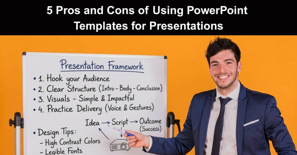
Picture this: you have a long boardroom presentation due by Friday and a blank slide deck staring back at you. Pre-designed PowerPoint templates promise a convenient shortcut, letting you skip hours of layout work and jump straight into content. Yet seasoned presenters warn that ready-made designs can backfire, flattening your message and blending your deck into every other slide the audience has seen this month.
This article weighs both sides of that decision, examining what templates do well and where they quietly cost you time, credibility, and originality. You will see five advantages worth embracing and five disadvantages to watch for, each grounded in practical examples from everyday presentation work. By the end, choosing between a template and a custom deck becomes a deliberate, informed judgment rather than a guess.
What Are PowerPoint Templates?
PowerPoint templates are pre-designed layouts or frameworks that give presenters a ready-made foundation for building decks. They package slide themes, color schemes, fonts, icons, and background images into one consistent starting point. That means anyone, regardless of design training, can open a template and begin shaping a polished presentation almost immediately, with layouts and placeholders already aligned to professional standards.
Three broad categories cover most of what templates offer users:
- Slide Themes and Layouts: Prebuilt slide masters keep every page visually coordinated from start to finish.
- Design Elements Included: Color palettes, fonts, icons, and image placeholders ship together in each template.
- Built-In Placeholders: Click-and-type boxes for titles, text, and visuals remove manual formatting guesswork.
5 Pros or Advantages of Using PowerPoint Templates
The case for templates rests on speed, polish, and accessibility. For presenters juggling deadlines, stakeholder reviews, and limited design support, a well-chosen template removes most of the mechanical work of deck building. The five advantages below explain why templates remain a default choice across corporate, academic, and creative settings, and fewer distractions mean more energy for the message itself.
1. Time-Saving
Starting from a blank canvas forces you to make dozens of formatting decisions before a single idea lands on a slide. Templates eliminate that overhead, letting you concentrate on wording, data, and storytelling instead of alignment and font sizes. Plugins such as the SlideBazaar PowerPoint plugin even let you build and insert custom template slides on demand without ever leaving PowerPoint.
Three time-saving effects make pre-built templates genuinely hard to beat:
- No Formatting From Scratch: Colors, fonts, and layouts already exist, so nothing needs building before content begins.
- Faster Revisions: Swapping slide masters or brand colors updates the entire deck in one action.
- Last-Minute Safety Net: A polished skeleton supports urgent edits, late additions, and rushed final tweaks.
Real-Life Example: A marketing manager with two days to prepare an investor update opens a corporate template and drops in the quarter’s key figures. Instead of spending the first afternoon wrestling with alignment and placeholders, she finishes her core slides by lunch and spends the rest of the day refining the narrative.
2. Consistency in Design
Audiences absorb information faster when every slide follows a consistent visual hierarchy. Templates enforce identical spacing, type treatments, and header placement across the whole presentation, so attention stays on the content rather than on jarring design shifts. This predictable structure also makes complex decks easier for viewers to navigate and for presenters to rehearse, and that coherence quietly builds credibility before you speak.
A unified design delivers its consistency benefits in three distinct ways:
- Guided Audience Focus: Uniform layouts minimize distractions so viewers follow the narrative without effort.
- Reinforced Brand Recognition: Repeated logos and color palettes make the organization instantly identifiable across slides.
- Stronger Credibility: A cohesive visual identity signals professionalism and preparation before you speak.
Real-Life Example: A mid-sized consulting firm uses the same branded template for every client deck, so partners recognize the house style instantly. When a junior analyst submits slides, even senior reviewers spend nearly all their time on substance rather than correcting mismatched fonts, colors, and logo placements that plague so many ad-hoc decks.
3. Professional Appearance
Professional templates carry the fingerprints of trained designers who understand composition, hierarchy, and restraint. These designs follow established principles of visual communication, so elements like contrast, alignment, and white space work together instead of competing. The result is a deck that looks intentional, credible, and professionally finished, radiating confidence even when the author has no design background to speak of.
That designer polish translates into three visible benefits for presenters:
- Visual Hierarchy: Careful arrangement of type and imagery guides the eye to the most important content first.
- Balanced Composition: Restrained use of color and spacing keeps slides clean, modern, and easy to scan.
- First-Impression Impact: A sophisticated look captures attention in the opening seconds of any presentation.
Real-Life Example: A young startup pitching to five leading venture investors selects a premium template with strong typography and generous white space. The deck earns repeated compliments on its polish during the meeting, and the founders credit the professional look with keeping attention fixed firmly on their traction story and growth metrics.
4. Guidance for Novice Users
For people new to presentation design, a blank slide is intimidating. Templates act as patient instructors, showing where titles, images, and talking points belong through built-in placeholder boxes. First-time presenters learn by doing: they arrange real content inside a sensible structure, absorbing lessons about layout, spacing, and flow that transfer to every future deck they build, and that guidance shortens the learning curve considerably.
Novice presenters gain three distinct advantages from a template’s built-in guidance:
- Clear Content Placement: Placeholders show exactly where titles, images, and bullet text should go.
- Immediate Professional Results: Beginners produce respectable-looking slides without mastering design software first.
- Transferable Design Skills: Repeated template use teaches layout fundamentals that improve future presentations.
Real-Life Example: A graduate student eager to impress assigns her first academic presentation, picks a university template, and follows its structure for title, methods, results, and conclusions. Her slides look organized enough that the faculty panel focuses on the research itself, and she finishes the entire project faster than classmates designing from scratch.
5. Variety of Designs
No two audiences demand the same thing, and templates come in a wide range of presentation styles, from data-heavy corporate reports to playful educational decks. Business templates favor clean charts and restrained color, while classroom designs add quizzes, diagrams, and interactive elements. That breadth means presenters can usually find a starting point that matches their content, audience, and personal taste.
This design variety creates practical flexibility in three important ways:
- Audience Matching: Templates tailored to business, education, or creative contexts resonate more quickly.
- Content-Specific Layouts: Data-focused templates optimize charts and graphs for precise, scannable communication.
- Personal Preference: Diverse aesthetics let presenters choose a look that feels authentic to them.
Real-Life Example: A sales enablement team searches a marketplace for a template with bold statistics and minimal decoration, matching how their buyers consume information. They also download an illustrated option for onboarding sessions, even proving that access to varied designs lets one team serve completely different internal audiences without commissioning custom work.
5 Cons or Disadvantages of Using PowerPoint Templates
The convenience of templates comes with trade-offs that show up when your message needs to stand out. Popular designs get reused constantly, customization runs into limits, and visual clutter can sabotage otherwise solid content. Understanding these five disadvantages helps you decide when a template truly serves your presentation and when custom design is the wiser investment.
1. Lack of Originality
Because anyone can download the same files, popular templates quickly become unfortunately familiar. Audiences that sit through many corporate presentations start recognizing the same reused designs, and a once fresh deck can suddenly feel generic. When your slides look like the last three decks your audience saw, the message loses some of its power before you even start speaking.
Heavy template reuse damages originality in three very specific ways:
- Generic First Impressions: Familiar layouts make audiences assume the content will be predictable too.
- Audience Fatigue: Viewers who have seen the design before tune out earlier and retain less, which makes delivering a killer presentation even more important.
- Weakened Impact: Overused templates reduce the perceived novelty of your data and ideas.
Real-Life Example: Three vendors pitch the same client inside a single month, and two of them open with the identical conference-style template. The client eventually tells the account team that both decks felt interchangeable, which forces the second vendor into an uphill battle to prove its offering truly differs from the first.
Solution: Customize the template aggressively so it stops resembling the original download. Swap the template’s default color scheme, replace stock imagery with original photos, and redesign at least the title slide around your brand. These simple changes restore enough uniqueness to differentiate your deck while preserving the layout efficiency you originally wanted.
2. Limited Customization Options
Templates impose structural constraints that can frustrate anyone with specific needs. Elements are often grouped or locked in ways that make repositioning difficult, and straying far from the intended layout can break the design. Adapting a template to strict corporate branding or an unusual content flow may demand design skills that defeat the time-saving purpose of using one, and in practice this friction appears quickly.
Customization limits typically surface in three especially frustrating areas for users:
- Locked Design Elements: Grouped objects and fixed placeholders resist repositioning without breaking the layout.
- Branding Conflicts: Template colors and fonts rarely match corporate guidelines without significant rework.
- Skill Requirements: Major modifications demand practical design skills that casual users simply do not have.
Real-Life Example: A nonprofit adopts a fundraising template, then quickly discovers its logo unexpectedly clashes with the accent color and its program names exceed the placeholder width. Staff ends up spending nearly a full day manually resizing boxes and editing master slides, wiping out the efficiency the template was supposed to deliver.
Solution: Treat the template as a starting skeleton rather than a finished product. Before committing, verify up front that placeholders, color schemes, and layouts tolerate the branding and content you need. If fundamental elements refuse to adapt, choose a different template or commission a custom master slide set that matches your identity.
3. Difficulty in Finding the Right Fit
Marketplaces offer thousands of templates, and that abundance creates its own problem entirely. Every promising download promises something different in layout, style, and structure, so choosing a presentation template becomes a full research project. Presenters can burn more time hunting for the perfect template than they would have spent building a simple deck from scratch, and the search rarely ends with confidence.
The template search problem shows up in three especially frustrating ways:
- Analysis Paralysis: Hundreds of similar options make committing to any single design feel risky.
- Mismatched Promises: Screenshots rarely reveal how a template behaves once real content is added.
- Wasted Evaluation Time: Downloading, testing, and rejecting candidates consumes the hours templates save.
Real-Life Example: An increasingly frustrated operations manager spends an entire evening cycling through dozens of template galleries for a quarterly business review. Each candidate looks right in the preview, but real data spills out of the layouts every single time, forcing several more downloads until sheer fatigue, not fit, finally ends the search.
Solution: Define your requirements before you open a single gallery: audience, tone, content density, and brand colors. Narrow the field to at most two or three candidates, then test them quickly with real content, and judge by fit rather than first impressions. This structured approach turns an overwhelming search into a genuinely quick, confident decision.
4. Risk of Cluttered Layouts
Not every template respects the balance between visual flair and readability. Designs packed with graphics, animations, and dense text can overwhelm viewers, creating overwhelming cognitive load that buries the core message. Presenters who choose templates for their looks alone sometimes discover too late that those same looks compete with the content they are trying to communicate. Presentation experts warn that clutter kills retention.
Cluttered layouts damage overall presentation effectiveness in three distinct ways:
- Cognitive Overload: Too many competing elements strain working memory and reduce information retention.
- Buried Key Messages: Busy backgrounds and excess decoration drown out the points that matter most.
- Distracted Audiences: Animated flourishes pull attention away from the speaker and the data presented.
Real-Life Example: A veteran compliance trainer adopts a high-energy, brightly decorated template full of motion graphics for a workshop. Learners unfortunately keep commenting on the animations instead of the procedures, and follow-up quizzes the week after show that participants remember the flashy visual effects far more vividly than the actual workplace safety policies.
Solution: Audit any template carefully for white space, text volume, and animation before committing. Choose designs with generous margins, limited color palettes, and restrained motion, then strip decorative elements that do not serve the content. If a slide feels crowded, simplify it without hesitation, because clarity always outranks decoration in professional communication.
5. Outdated or Poorly Maintained Templates
Templates are snapshots of design trends at the moment they were published, and those trends age quickly. Fonts that looked modern a few years ago now read as dated, and layouts that once felt fresh can feel tired next to contemporary branding. Presenters who do not revisit or refresh their templates risk projecting an outdated image, which undercuts the professionalism templates are supposed to provide.
Outdated or poorly maintained templates damage presentations in three ways:
- Dated Visual Style: Old fonts and layouts make content feel older than it actually is.
- Broken Placeholders: Legacy templates often contain corrupt layouts and missing media files.
- Version Conflicts: Files created in older PowerPoint versions may render inconsistently today.
Real-Life Example: A regional bank still uses a template purchased years ago, complete with its original clip-art style and serif headings. Prospective clients mention that the brand looks dated, and the marketing team unfortunately spends several weeks rebuilding the deck library from scratch to match the modern identity the bank recently adopted.
Solution: Schedule a quarterly template review and update files whenever branding or design standards change. Replace outdated fonts, refresh colors, and test every placeholder with real content before major presentations. For critical decks, consider rebuilding the master slide set from a current template so the entire library stays consistent and modern.
Conclusion
PowerPoint templates earn their popularity by making professional-looking presentations dramatically easier to produce and refine. They save time, enforce visual consistency, and give novice presenters a credible starting point, all while offering remarkable variety across industries and audiences. Yet the same convenience carries real costs, since originality suffers, customization hits limits, finding the right fit takes effort, and cluttered layouts can undermine otherwise strong content.
The smartest presenters treat templates as tools rather than shortcuts, selecting them deliberately against the message, audience, and brand. They customize enough to feel original, test layouts with real content, and ruthlessly simplify anything that distracts. Do the same, and templates become a reliable accelerator; ignore their limits, and they quietly dilute your message before you even begin speaking. That consistent discipline makes the difference.
Frequently Asked Questions About PowerPoint Templates
Are PowerPoint templates still useful now that AI can generate presentations?
Absolutely, and in many ways they matter more. AI presentation tools like Copilot in PowerPoint generate drafts quickly, but they still rely on templates and brand guidelines to keep the output on-model. Templates give you control over layout, tone, and visuals that pure AI generation does not always guarantee, so combining both usually beats using either alone.
How can I customize a PowerPoint template without ruining the design?
Start with the theme rather than individual slides, because theme changes update fonts and colors everywhere at once. Adjust the master slides to move or resize recurring elements, then replace sample images with your own. Save a copy first before major edits, and test on a few slides before applying changes across the entire presentation.
Where can I find quality PowerPoint templates without paying?
Free template libraries exist inside PowerPoint itself, along with Microsoft’s template gallery and reputable marketplaces that offer limited free packs. Government and university sites also sometimes publish clean, professionally designed templates for public use. Whatever the source, check licensing terms every time, since free files may restrict commercial use or require attribution in client-facing work.
What is the difference between a PowerPoint theme and a template?
A theme controls the design system: fonts, colors, and background styles that apply across an entire presentation. A template is a complete file that combines a theme with pre-built slide layouts, placeholder content, and often example graphics. In practice, templates are built on themes, which is why changing a template’s theme restyles every slide it contains.
How do I stop my template-based presentation from looking generic?
Personalize the template before adding any content: swap the color palette, replace stock photography with original images, and redesign the title slide around your brand. Inject your voice through examples, case studies, and specific numbers that no other presenter would include. Small custom touches make familiar layouts feel fresh without requiring full custom design work.
Suggested articles:
- How AI Tools Revolutionize PowerPoint Presentations: A Full Guide
- 10 Mistakes to Avoid in Your Project Management Presentation
- How to Use an AI PPT Generator to Create Stunning Presentations in Minutes

Daniel Raymond, a project manager with over 20 years of experience, is the former CEO of a successful software company called Websystems. With a strong background in managing complex projects, he applied his expertise to develop AceProject.com and Bridge24.com, innovative project management tools designed to streamline processes and improve productivity. Throughout his career, Daniel has consistently demonstrated a commitment to excellence and a passion for empowering teams to achieve their goals.