
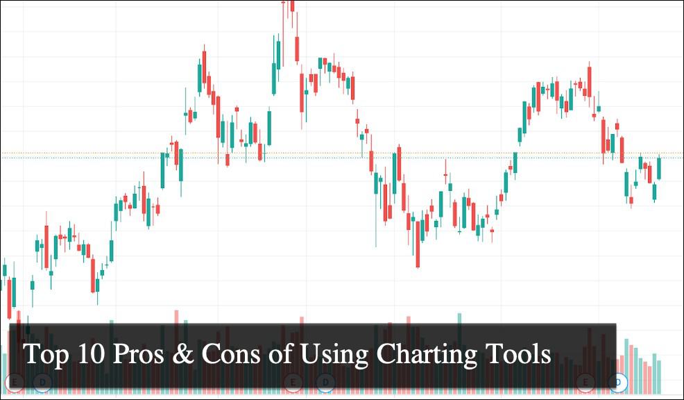
Top 10 Pros & Cons of Using Charting Tools
Charting tools have become essential for professionals across various industries. These tools offer a visual representation of data, making it easier to understand trends, patterns, and relationships. Whether in finance, marketing, or any field that relies on data analysis, charting tools can significantly enhance your ability to interpret and present information. They offer a variety of features, from simple line charts to complex, multi-layered visualizations.
However, while charting tools are powerful, they have drawbacks. Selecting the right tool for your needs can be challenging, especially when balancing advantages against limitations. Understanding the pros and cons of charting tools is crucial for making an informed decision that aligns with your business goals. This article will explore five key advantages and five significant disadvantages of using charting tools.
The 5 Pros or Advantages of Using Charting Tools

Charting tools have become indispensable in the modern professional environment. Their ability to transform raw data into insightful visualizations is unparalleled. Here, we will explore five key advantages that make charting tools a vital asset for any business.
Advantage #1: Enhanced Data Visualization
One of the most significant advantages of charting tools is their ability to enhance data visualization. By converting complex data sets into easy-to-understand visuals, these tools help users quickly grasp key insights.
- Simplifies complex data into visual formats
- Allows for easier identification of trends and patterns
- Facilitates better communication of data insights
Real-life Example: Consider the financial trading industry, where traders rely heavily on charting tools to make informed decisions. Tools like MetaTrader 4 (MT4) and TradingView are popular choices among traders. MT4 offers basic charting features, while TradingView provides more advanced options, such as custom indicators and social sharing capabilities. When MT4 is compared with TradingView, the latter is often preferred for its superior data visualization capabilities, which help traders identify trends more effectively.
Advantage #2: Improved Decision-Making
Charting tools play a crucial role in enhancing decision-making processes. By presenting data in a visual format, they enable users to analyze information quickly and make informed decisions.
- Provides a clear visual representation of data
- Supports faster data analysis and interpretation
- Enables data-driven decision-making
Real-life Example: In marketing, managers often use charting tools to track campaign performance. By visualizing click-through rates, conversion rates, and return on investment (ROI), they can quickly identify which strategies are working and which need adjustment. This rapid analysis allows for more agile and effective decision-making.
Advantage #3: Customization and Flexibility
Another critical advantage of charting tools is their high customization and flexibility. Users can tailor charts to meet their specific needs by choosing the type, adjusting the color scheme, or adding annotations.
- Offers various chart types and customization options
- Adapts to different industries and use cases
- Allows users to create personalized dashboards
Real-life Example: In business analytics, professionals often must present data that resonates with different stakeholders. A customized dashboard that highlights key metrics in a visually appealing manner can make all the difference in a presentation. Tools like Tableau allow users to customize their charts extensively, ensuring the data is informative and visually engaging.
Advantage #4: Integration with Other Tools
Charting tools often integrate seamlessly with other software applications, enhancing their functionality and usability. This integration benefits businesses relying on multiple data analysis and reporting tools.
- Integrates with data sources like databases and spreadsheets
- Compatible with other business tools, such as CRM or ERP systems
- Streamlines data flow between different platforms
Real-life Example: A sales team might use a Customer Relationship Management (CRM) system like Salesforce to manage client data. By integrating Salesforce with a charting tool like Power BI, they can create real-time sales dashboards that automatically update as new data comes in. This integration streamlines the reporting process and ensures that the team always has access to the latest information.
Advantage #5: Increased Efficiency and Productivity
Finally, charting tools significantly increase efficiency and productivity by automating many aspects of data visualization. This automation frees up time for users to focus on analysis rather than data preparation.
- Automates data visualization processes
- Reduces the time spent on manual data analysis
- Enhances productivity by allowing users to focus on strategic tasks
Real-life Example: Analysts often need to prepare reports on market trends and financial performance in finance. Using charting tools like Excel or Google Sheets, they can automate the creation of charts and graphs, saving hours of manual work. This increased efficiency allows them to spend more time analyzing the data and providing valuable insights to their clients.
The 5 Cons or Disadvantages of Using Charting Tools

While charting tools offer numerous benefits, they are not without their challenges. It’s essential to consider these drawbacks when deciding whether or not to invest in such tools. Below are five significant disadvantages of using charting tools.
Disadvantage #1: Steep Learning Curve
One of the most significant disadvantages of charting tools is their steep learning curve. Many of these tools require users to have a certain level of technical expertise to utilize them effectively.
- Requires familiarity with data visualization concepts
- Some tools have complex interfaces that can be difficult to navigate
- Users may need to invest time in training and learning
Real-life Example: Adopting a powerful charting tool like Tableau can be overwhelming for a small business owner with limited technical skills. The tool’s complexity of features and a vast array of customization options may require extensive training.
Solution: To resolve this issue, businesses can offer training sessions or opt for simpler tools with a more user-friendly interface.
Disadvantage #2: Cost Considerations
Another drawback of charting tools is their cost. While there are free options available, many advanced tools have a hefty price tag, making them less accessible for smaller businesses or individuals.
- Subscription-based pricing can be expensive
- Additional costs for advanced features or integrations
- High initial investment for enterprise-level tools
Real-life Example: A startup company might find the cost of using a comprehensive charting tool like Microsoft Power BI prohibitive. The subscription fees and the cost of integrating the tool with other business systems can quickly add up.
Solution: To mitigate this issue, companies can start with free or lower-cost alternatives and upgrade as their needs and budgets allow.
Disadvantage #3: Data Security Concerns
Data security is a significant concern when using charting tools, especially those that require cloud-based storage or integration with other systems. Sensitive information could be at risk if proper security measures are not in place.
- Risk of data breaches if security is compromised
- Potential issues with data privacy and compliance
- Dependency on third-party security protocols
Real-life Example: A healthcare provider using a charting tool to visualize patient data must ensure that the tool complies with regulations like HIPAA. If the tool is not secure, sensitive patient information may be exposed.
Solution: To address this, organizations should choose tools with robust security features and adhere to industry-specific regulations.
Disadvantage #4: Data Overload
While charting tools are designed to simplify data analysis, they can sometimes lead to data overload. Users may be overwhelmed by the information presented in complex charts and graphs.
- Complex charts can be complicated to interpret
- Too much data can obscure key insights
- Users may struggle to focus on the most critical information
Real-life Example: A marketing team might use a charting tool to track multiple campaigns simultaneously. If the tool presents too much data on a single dashboard, the team might struggle to identify which campaigns are performing well and which are underperforming.
Solution: To prevent this, users should create clear, concise visualizations highlighting the most relevant data.
Disadvantage #5: Limited Customization in Some Tools
While many charting tools offer extensive customization options, some have limitations that can frustrate users. These limitations can make creating the exact visualizations needed for specific use cases challenging.
- Some tools restrict the types of charts that can be created
- Limited options for customizing chart aesthetics
- Inflexibility in integrating with specific data sources
Real-life Example: A data analyst working with a free version of a charting tool may find that they cannot customize their charts to the extent required. This limitation could hinder their ability to present data effectively to stakeholders. To overcome this challenge, analysts can either upgrade to a paid version with more features or explore alternative tools that offer the desired level of customization.
Conclusion
In summary, charting tools are powerful assets that can significantly enhance data visualization, improve decision-making, and increase efficiency. However, they also come with challenges like a steep learning curve, high costs, and potential data security risks. To maximize the benefits of charting tools, it is crucial to select the right tool for your specific needs, provide adequate training for users, and implement robust security measures.
Ultimately, the decision to use charting tools should be based on carefully evaluating the pros and cons. By understanding the advantages and disadvantages, businesses and individuals can make informed choices that align with their goals and resources. Whether you’re a seasoned professional or new to data visualization, the right charting tool can be a game-changer in how you analyze and present data.