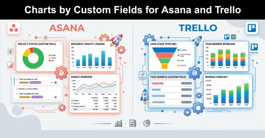
Project teams that rely on Asana and Trello often reach a point where raw task lists no longer tell the full story. Custom field charts give managers a faster way to see patterns in workload, priority, and approval status without manually combing through boards. This shift toward visual reporting has become standard practice for teams that need clear, defensible data for stakeholders.
Building accurate, data-driven reports is only part of the job. Presenting that information so it is genuinely useful to executives, clients, and team leads matters just as much, which is why custom field charts have become a core feature for serious project reporting. The next sections walk through how this works in practice using Bridge24, which enables you to create dynamic charts that are easy to interpret from your existing data on Trello and Asana.
Use Custom Fields to Create Dynamic Charts
Custom fields let Asana and Trello users add structured data to tasks and cards beyond the default fields, giving every workflow more context. A field might track approval status, product category, release version, or a simple yes or no flag for required action. Once that data is populated consistently, it becomes the raw material for meaningful, chartable reporting.
The challenge most teams run into is extraction. Native views in both tools are built for managing individual tasks, not for summarizing dozens of projects at once. Without a dedicated reporting layer, spotting business trends or evaluating project outcomes means exporting data manually and rebuilding it in a spreadsheet, which is slow and error-prone for recurring reports.
Several common custom field types appear across most reporting workflows. Below are practical uses teams apply when configuring fields for chart-ready reporting:
- Status Tracking: A dropdown field marking a task as pending, in review, or approved gives a clean basis for status distribution charts across an entire project portfolio.
- Category Labels: Text or dropdown fields that classify tasks by product line, client, or content type allow teams to compare output volume across categories at a glance.
- Priority Levels: A low, medium, high, or urgent field helps surface where bottlenecks concentrate, which is especially useful when stacked against another dimension like stage.
- Yes/No Flags: Simple boolean fields indicating whether a sign-off, review, or compliance step occurred make audit-style reporting straightforward to generate.
- Numeric Fields: Effort estimates, budget figures, or hour counts support sum-based charts rather than simple counts, which is useful for capacity planning.
Bridge24 Offers a Simple Solution
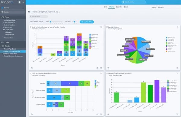
Bridge24 connects directly to Asana and Trello accounts, pulling live task and card data into a dedicated reporting layer — eliminating the need to manually export CSVs or rebuild pivot tables from scratch. Teams get an always-current view of their project data on demand, which significantly reduces the time spent on recurring manual reporting. Here’s what makes Bridge24 a powerful solution for custom field reporting:
- Multiple Chart Types: Choose from pie, doughnut, polar, horizontal, and vertical bar charts, each suited to different kinds of custom field data. For example, a status field with several categories might work best as a doughnut chart, while a numeric effort field comparing teams often reads more clearly as a horizontal bar chart.
- Custom Field Grouping: Fields such as website name, client account, or workflow stage can drive a fully interactive chart with a single click, using live data pulled directly from your connected Asana or Trello account. This makes it easy to generate meaningful visuals without any manual data preparation.
- Drill-Down Capability: Clicking any chart segment instantly surfaces the underlying task list behind that data point, so managers and team leads can investigate specific results without switching between tools or digging through boards manually.
- Legend Controls: Individual chart segments can be toggled on or off through the legend, giving users a cleaner, more focused view when presenting to stakeholders or filtering out irrelevant categories.
- PDF Export: Finished charts can be exported as a PDF at any time, making it straightforward to share polished, professional reports with executives, clients, or external partners without requiring them to access the platform directly.
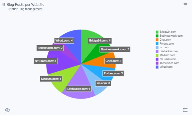
Chart Stacking
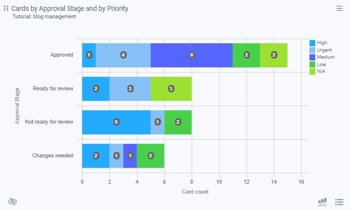
Chart stacking displays two variables within a single chart, giving reports more depth than a single grouped view can provide on its own. This is particularly useful when a team needs to understand the relationship between two custom fields rather than viewing each one in isolation, such as workflow stage against urgency.
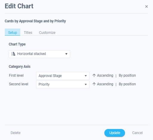
A practical example involves a Trello board tracking cards through an approval workflow. A manager who wants to know how many cards sit at each approval stage, broken down further by priority level, can stack a priority custom field on top of an approval stage field. The result is a single chart showing both the count per stage and the distribution of urgency within each stage.
Combining two variables into one chart makes detailed reporting considerably easier to read at a glance, particularly for stakeholders who only have a few minutes to review a status update. The following adjustments are commonly used once a stacked chart is generated:
- Chart Type Switching: Users can toggle between bar, pie, and other chart formats to find the clearest way to present a given pair of variables.
- Variable Reordering: Swapping which field appears as the primary grouping versus the stacked layer often changes which patterns stand out most clearly.
- Legend Filtering: Hiding specific segments through the legend helps isolate one part of a dataset without rebuilding the entire chart from scratch.
- Export Settings: Finished charts can be saved or exported as PDF files, making them easy to attach to status emails or stakeholder updates.
Users can easily modify the chart by selecting different chart variables, types, or other unique settings based on the kind of reports they want to create and the information they want to see.
Getting Started with Custom Field Charts
Setting up custom field charting for the first time involves a short sequence of steps that apply consistently across Asana and Trello accounts. Most teams complete the initial setup in under an hour, assuming custom fields are already populated with consistent data across the relevant boards or projects.
Following a consistent setup process helps avoid the most common configuration mistakes:
- Audit Existing Custom Fields: Review which fields are already in use across boards or projects and confirm the data entered is consistent enough to chart accurately.
- Connect the Reporting Tool: Sync Bridge24 or a similar reporting layer to the Asana or Trello account so task and card data flows into the reporting interface.
- Select Grouping Fields: Choose the primary custom field to group by, and optionally a secondary field for stacked charts.
- Choose a Chart Type: Match the chart format to the data, using bar charts for comparisons and pie or doughnut charts for proportional breakdowns.
- Export or Share: Save the finished chart as a PDF or embed it into a recurring report for stakeholders.
Common Mistakes to Avoid
Inconsistent data entry is the most frequent cause of misleading charts, particularly when multiple team members populate the same custom field using slightly different labels or formats. A field meant to capture priority as low, medium, high, and urgent loses its value the moment someone enters “Med” or “medium-high” instead.
Choosing the wrong chart type for the underlying data is another common issue worth flagging early. The following points cover frequent errors teams make when setting up custom field reporting:
- Mismatched Field Types: Using a free-text field where a dropdown would enforce consistency leads to fragmented, hard-to-group data once charts are generated.
- Overloaded Stacking: Stacking too many categories within one field makes a chart visually cluttered rather than clarifying the underlying pattern.
- Ignoring Stale Data: Charts built from outdated exports rather than a live connection can misrepresent current project status to stakeholders.
- Skipping Legend Review: Failing to check which segments are visible before exporting can result in incomplete or misleading shared reports.
Bridge24 Vs Native Reporting
| Feature | Bridge24 | Asana Native | Trello Native |
|---|---|---|---|
| Custom field charting | Yes | Limited | Limited |
| Chart stacking | Yes | No | No |
| Two-level grouping | Yes | No | No |
| PDF export | Yes | Limited | Limited |
| Multi-project reporting | Yes | Limited | No |
| Free trial available | Yes | N/A | N/A |
Conclusion
Custom field charts turn scattered Asana and Trello data into reporting that stakeholders can actually use, replacing manual spreadsheet work with live, interactive views. Tools like Bridge24 extend native capabilities by adding chart stacking, two-level grouping, and PDF exporting, all built around the custom fields teams already maintain.
As project portfolios grow more complex, the ability to visualize status, priority, and category data quickly becomes less of a convenience and more of a requirement. Teams evaluating their reporting workflow should test a custom field charting tool against a real project before the next reporting cycle arrives. To learn more about Bridge24, visit us on Facebook, X(Twitter), or YouTube. Try Bridge24 today for free.
Frequently Asked Questions About Custom Field Charts
What are custom field charts in Asana and Trello?
Custom field charts are visual representations, such as pie, bar, or doughnut charts, built from the custom field data teams already track on tasks or cards. Rather than reading through individual items, managers can see distributions of status, priority, or category across an entire project or portfolio in one view.
Can Trello and Asana create charts without a third-party tool?
Both platforms offer limited native dashboard and chart features, but they generally lack support for grouping by custom fields, stacking two variables, or generating reports across multiple projects simultaneously. Third-party reporting tools fill that gap for teams needing deeper analysis.
What is chart stacking and when should it be used?
Chart stacking displays two custom field variables within a single chart, such as approval stage combined with priority level. It works best when a team needs to understand the relationship between two data points rather than viewing each one separately.
How do I export a custom field chart for a report?
Most reporting tools, including Bridge24, allow finished charts to be exported directly as PDF files, which can then be attached to status updates, shared with stakeholders, or archived for year-end reporting purposes.
Is it safe to connect Asana or Trello data to a third-party reporting tool?
Reputable reporting platforms use secure, read-or-write authenticated connections through each platform’s official API and do not require sharing login credentials directly. Teams should review a vendor’s security documentation before connecting any account containing sensitive project data.
Suggested articles:
- Asana: Easily Create Interactive Charts and Graphs
- Trello: Easily Create Interactive Charts and Graphs
- Trello Export to Excel (Cards and Boards) with Bridge24
Daniel Raymond, a project manager with over 20 years of experience, is the former CEO of a successful software company called Websystems. With a strong background in managing complex projects, he applied his expertise to develop AceProject.com and Bridge24.com, innovative project management tools designed to streamline processes and improve productivity. Throughout his career, Daniel has consistently demonstrated a commitment to excellence and a passion for empowering teams to achieve their goals.