Agile project metrics matter just as much to leadership teams as they do to project managers. Senior executives need visibility into predictable delivery, team performance, and overall project health. Understanding the right metrics allows leaders to make informed decisions, identify risks early, and support their teams with the resources and direction needed to succeed consistently. Without a structured approach to measurement, even high-performing agile teams can struggle to communicate progress in ways that resonate with executive stakeholders.
The metrics covered in this guide span delivery performance, quality assurance, cost management, and trend forecasting, giving leaders at every level a practical framework for evaluating agile success. Read on to explore the 16 key agile project metrics every executive should understand and actively monitor.
Agile Strategy Overview
Senior stakeholders are primarily interested in key performance indicators that reflect the delivery predictability of agile teams. At a minimum, executives should review team velocity over time and monitor work in progress to confirm that teams remain focused on high-priority tasks. Different stakeholders can draw from unique sets of agile metrics depending on their reporting needs and level of involvement in the project.
Agile metrics serve two core purposes: they provide a way to generate status reports for stakeholders, and they help teams identify opportunities to improve their own performance. For those new to agile reporting, building familiarity with burndown charts, control charts, and scrum processes is a necessary first step before interpreting any performance data with accuracy or confidence.
Core Agile Delivery Metrics
1. Cycle Time
Cycle time is the foundation of agile performance measurement and must be understood before any other metric can be read or interpreted meaningfully. It measures the total time spent working on an issue, from the moment work begins to when it is completed. If an issue is reopened, the additional time spent is included in the overall cycle time calculation.
Sprint or scrum cycle time refers to the fixed duration of each sprint. This duration directly influences the expected output of the team and sets the stage for calculating and understanding velocity. Keeping cycle times consistent across sprints is essential for teams to build reliable delivery rhythms and for stakeholders to set accurate expectations.
2 Agile Team Velocity
Velocity is one of the most valuable metrics available to agile teams and has no direct equivalent in traditional waterfall project management. It is calculated by analyzing completed story points across multiple iterations, then averaging them to establish a reliable throughput baseline. Once the baseline is set, the team can commit to a realistic scope each sprint with greater confidence.
At the start of a project, velocity will fluctuate as the team adjusts its estimation approach. After a few iterations, it should stabilize and become a dependable planning reference. If velocity charts become erratic over time, this signals a need to investigate the estimation and commitment process, including whether the team is overcommitting, facing external pressure, or dealing with misaligned expectations from stakeholders.
3. Sprint Burndown Chart
The sprint burndown chart is one of the most widely used Scrum metrics for tracking iteration progress. Burn rate, which tracks work completed against man-days, functions as the budget equivalent to velocity and forms the basis of this chart. It allows teams to monitor both cost and scope simultaneously throughout a sprint.
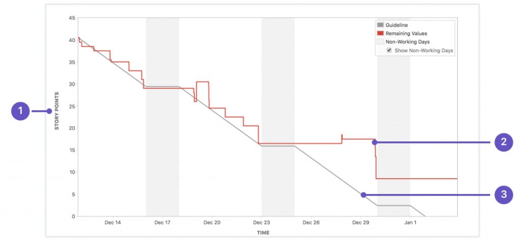
The burndown chart displays remaining work over time, giving teams and stakeholders a quick visual indicator of whether the project is on track to meet its targets. Anti-patterns in burndown charts, such as flat lines or late drops in the remaining work curve, can signal blockers, inaccurate estimation, or deferred task completion and should be investigated promptly.
4. Sprint Burn-Up Charts
The sprint burn-up chart shows the total amount of work and how much has been completed over time. Unlike the burndown chart, which focuses on what remains, the sprint burn-up chart makes added or removed scope far more visible. This transparency is particularly valuable when requirements shift mid-sprint, and stakeholders need a clear picture of scope changes and their impact.
5. Work in Progress
Work in progress, commonly referred to as WIP, includes any software that has been started but not yet completed or deployed to production. Managing WIP carefully is critical because unfinished work consumes investment without delivering any return. Below are three key reasons why limiting Work in Progress is essential:
- ROI Consumption: WIP represents money spent without return, making it a financial risk that must be actively managed and limited throughout the project lifecycle.
- Bottleneck Concealment: Excessive WIP hides process bottlenecks that slow overall workflow, making it harder to identify and resolve the root causes of delays.
- Rework Risk: Stories not yet accepted carry the potential for unknown rework, as requirements or expectations may still change before final sign-off.
WIP limits are agreed upon by the team before a project begins and are enforced by the team facilitator. When a WIP limit is reached, the team pauses and works together to clear the bottleneck before proceeding. John Little’s Law, a formula rooted in queueing theory, mathematically proves that the duration of a work queue depends on its size, reinforcing why WIP limits are a foundational agile practice.
6. Control Charts
Control charts give teams a precise view of process stability by tracking how long individual issues take to complete over a given time period. They are particularly useful for identifying outliers and understanding whether delays are caused by systemic issues or isolated events. Teams can use control charts to refine their processes and improve delivery consistency over time.
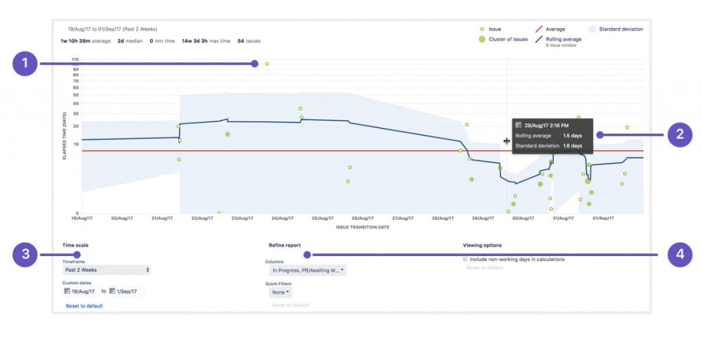
With a control chart, teams can view individual issue details, zoom into specific time periods, configure custom timeframes, and filter results by columns, swimlanes, or workflow stages. These capabilities make control charts a versatile and practical tool for both scrum masters and senior stakeholders seeking insight into process performance trends.
Quality & QA Metrics for QA Managers
Quality metrics provide QA managers with the data they need to assess testing effectiveness, manage defect flow, and maintain software reliability across sprints. Tracking these indicators consistently helps teams catch issues early, reduce technical debt, and ensure that quality standards are upheld throughout the entire development lifecycle.
7. Defect Detection Rate
Defect detection rate measures the number of defects identified per iteration. In theory, this rate should correlate with the team’s velocity, under the assumption that developers produce defects at a consistent or decreasing rate as the project matures. A higher story point delivery count should naturally correspond to a higher number of reported defects within the same iteration period.
8. Defect Closure Rate
Defect metrics like closure rate track how many defects are resolved within a given iteration. Ideally, this number should equal the defect detection rate for the same period. When closure rates fall short of detection rates, defects accumulate and travel forward into future sprints, increasing technical debt and reducing the team’s capacity to focus on new feature development.
9. Unit Tests
Unit testing involves testing individual functions or components of the software in isolation to confirm they behave as expected. Each unit represents the smallest testable part of an application, typically accepting one or a few inputs and returning a single output. Development teams are responsible for completing unit tests by the end of each sprint to maintain quality standards.
10. Code Coverage and Code Reviews
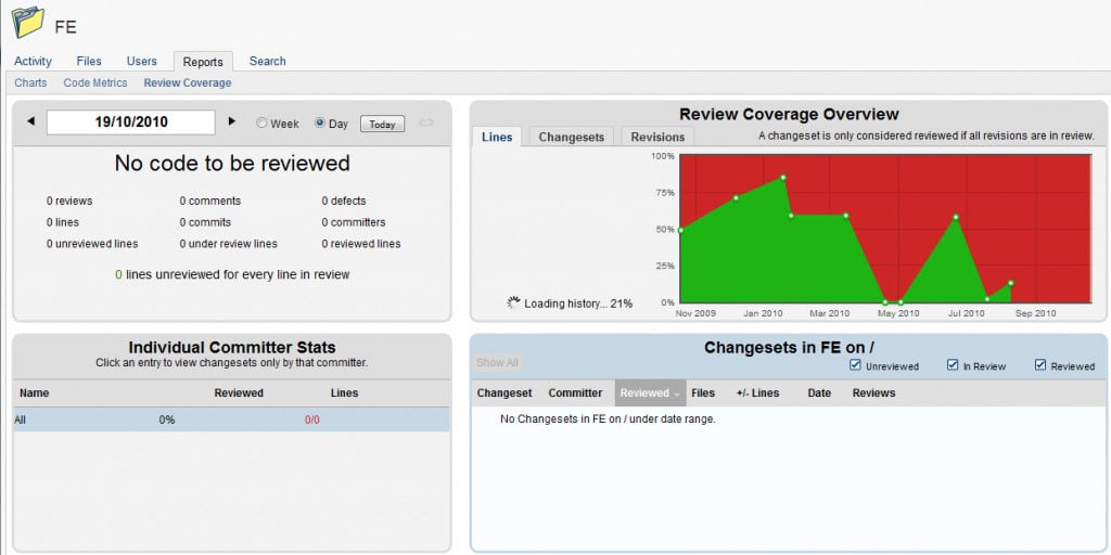
Code coverage is a software testing metric that measures how many lines of code are validated through automated test procedures. It helps teams understand how thoroughly the software has been tested and where gaps in coverage may exist. High code coverage reduces the risk of undetected bugs reaching production environments and is a standard quality benchmark for enterprise-grade software development.
11. Variance Analysis of Production Environments
Variance analysis identifies the difference between expected and actual performance across production environments. Some degree of variance is always expected, but it must remain within acceptable limits to avoid signaling systemic issues. Edward Deming identified two types of variation that every project manager should understand:
- Common Causes: These are routine, day-to-day variations that are inherent to the work process and should be treated as normal fluctuations rather than urgent problems.
- Special Causes: These are one-off or exceptional events that produce greater-than-normal variance and require direct investigation to prevent recurrence.
Deming noted that misidentifying common cause variation as a special cause, or the reverse, is a classic management mistake. This misinterpretation often leads to unnecessary interventions that destabilize processes rather than improve them.
Flow & System Metrics
12. Cumulative Flow Diagrams
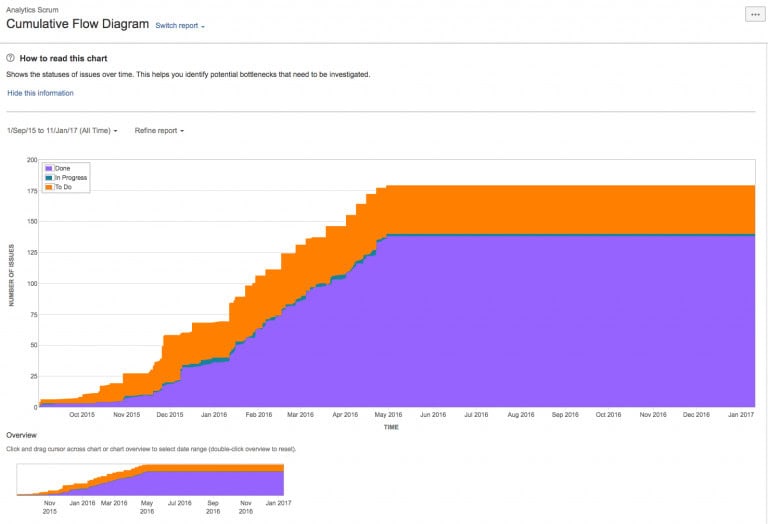
A Cumulative Flow Diagram (CFD) is an area chart that displays the status of work items over a defined time interval. The horizontal axis represents time, while the vertical axis represents the number of cards or issues. Each colored band in the chart corresponds to a specific workflow status, making it easy to spot bottlenecks and track the flow of work through the system.
Financial / EVM Metrics
13. EVM for Agile Project Management
EVM is a well-established traditional project management technique used to assess a project’s current performance and forecast future outcomes. It measures progress by tracking scope, schedule, and cost against a predetermined performance baseline. Agile Earned Value Management (EVM) is an adapted application of traditional earned value management, tailored for iterative delivery environments.
Rather than relying on conventional project artifacts, Agile EVM uses Scrum artifacts as its primary inputs and applies standard EVM formulas to generate familiar performance metrics. Estimates may be expressed in hours, story points, team days, or any other unit, provided that the chosen measure is applied consistently across all user stories and remains a numerical value.
To calculate Agile EVM metrics, begin by collecting the following data points for each user story: Estimated Story Points, Completed Story Points, and Actual Cost. These values are then aggregated, either by iteration or cumulatively across the project, to derive Planned Value and the Budget at Completion.
- Planned Value (PV) = Budget at Completion (BAC) x Story Points Planned
- Earned Value (EV) = Budget at Completion (BAC) x Story Points Completed

Test your knowledge in EVM by taking our 200-question PMP practice exam
Earned Value Management Graphs
The Earned Value Management (EVM) graph utilizes a Double S-Curve format, displaying story points and dollar value on the left (y-axis) and dates along the x-axis. This dual-axis design allows project teams to track both scope and cost performance on a single graph, providing a comprehensive view of project health. While the PMI-ACP examination does not heavily emphasize figures or graphs, candidates should be prepared to interpret EVM or S-curve graphs if presented. Note that no mathematical calculations will be required.
- A CPI value greater than 1 indicates the project is under budget, a value less than 1 indicates it is over budget, and a value equal to 1 indicates it is precisely on budget.
- An SPI value greater than 1 indicates the project is ahead of schedule, a value less than 1 indicates it is behind schedule, and a value equal to 1 indicates it is exactly on schedule.
A simple way to remember this: higher values indicate better performance, while lower values signal potential concerns.
14. Cost Performance Index (CPI)
Cost Performance Index (CPI) measures how efficiently a project is using its budget by comparing the value of work completed to the actual cost incurred. It provides a direct indication of whether the project is delivering value in line with its financial investment, making it essential for identifying cost overruns early.
- CPI > 1: Under budget (cost-efficient)
- CPI = 1: On budget
- CPI < 1: Over budget
Consistently tracking CPI highlights inefficiencies such as rework, poor estimation, or resource waste. For executives, it acts as a clear financial signal, allowing timely corrective action to keep spending aligned with delivered value.
15. Schedule Performance Index (SPI)
Schedule Performance Index (SPI) evaluates how efficiently a project is progressing against its planned timeline by comparing completed work to expected progress. It provides a clear indication of whether delivery is ahead, on track, or falling behind schedule.
- SPI > 1: Ahead of schedule
- SPI = 1: On schedule
- SPI < 1: Behind schedule
Monitoring SPI over time helps identify delays, dependency issues, and planning gaps before they escalate. It gives leadership a reliable view of time performance, enabling proactive adjustments to maintain delivery timelines and avoid last-minute pressure.
Forecasting Metric
16. Trend Analysis
Trend analysis collects and examines data over time to detect patterns that may predict future project trajectories. It is a leading metric, meaning it provides insight into what is happening now or what is likely to happen next, rather than reporting on what has already occurred. This makes it especially useful for product owners focused on customer satisfaction and proactive risk management.
Lagging metrics, such as budget consumed, reflect past performance and are less useful for early warning purposes. By contrast, trend analysis enables teams and product owners to spot emerging issues before they escalate into serious problems. Used alongside other agile metrics, trend analysis gives leadership a forward-looking lens on project health and delivery confidence.
Conclusion
Agile project metrics give executives and team leaders the visibility they need to manage delivery with confidence. From velocity and burndown charts to EVM and trend analysis, each metric serves a distinct purpose in painting a complete picture of project performance. Understanding how these indicators work together allows stakeholders at every level to make smarter decisions and hold teams accountable to realistic, data-driven commitments.
Implementing the right metrics is not about creating reporting overhead; it is about building a culture of transparency and continuous improvement. Teams that track and act on meaningful data consistently outperform those that operate without clear performance signals. As agile practices continue to evolve, investing in a well-structured metrics framework remains one of the highest-value steps any organization can take toward delivering reliable, high-quality software.
Frequently Asked Questions
What is the most important agile metric for executives to track?
Velocity is generally the most critical metric for executive visibility because it reflects the team’s consistent delivery capacity over time. Combined with WIP limits and burndown charts, velocity gives senior leaders a reliable picture of whether the team is on track to meet project commitments without requiring them to monitor day-to-day task details.
How often should agile metrics be reviewed by leadership?
Most agile metrics should be reviewed at the end of each sprint, typically during sprint reviews or stakeholder demo sessions. High-level indicators such as velocity trends and WIP levels can be reviewed more frequently if delivery risks are present. Establishing a regular cadence ensures that issues are caught early and addressed before they impact delivery timelines.
What is the difference between a burndown chart and a burn-up chart?
A burndown chart tracks the work remaining in a sprint, decreasing over time as tasks are completed. A burn-up chart tracks work completed against the total scope, making it easier to see when scope has been added or removed. Both charts serve complementary purposes, and using them together provides a more complete view of sprint progress.
Why are WIP limits important in agile project management?
WIP limits prevent teams from spreading their focus too thin across too many simultaneous tasks. When limits are enforced, bottlenecks become visible, and the team is encouraged to resolve blockers before taking on new work. This leads to faster cycle times, better quality outputs, and a more predictable delivery rhythm that both teams and stakeholders can rely on.
What is the difference between leading and lagging agile metrics?
Leading metrics, such as trend analysis and WIP levels, provide insight into current or future performance and allow teams to act before problems escalate. Lagging metrics, such as budget consumed or defects closed, reflect past performance and are useful for retrospective analysis. A balanced metrics strategy should include both types to give teams a complete view of project health.
Suggested articles:
- Project Metrics & KPIs Report: What Teams Track and Why It Matters
- 15 Quality Metrics Every Project Manager Needs to Know
- 8 Mandatory Metrics for Successful Project Execution
Shane Drumm, holding certifications in PMP®, PMI-ACP®, CSM, and LPM, is the author behind numerous articles featured here. Hailing from County Cork, Ireland, his expertise lies in implementing Agile methodologies with geographically dispersed teams for software development projects. In his leisure, he dedicates time to web development and Ironman triathlon training. Find out more about Shane on shanedrumm.com and please reach out and connect with Shane on LinkedIn.