The influence diagram is a powerful data visualization tool that graphically illustrates the relationships between variables. It enables users to analyze data, uncover meaningful connections among variables, and explore how one variable impacts another. This technique is valuable both for data analysis and as an exploratory tool for gaining deeper insights into complex systems.
These diagrams visually represent the interplay between multiple quantitative and categorical variables, simplifying the understanding of intricate scenarios. By presenting results in an intuitive format, influence diagrams are accessible to a wide audience, ranging from non-technical individuals to seasoned data analysis professionals.
Typically, project managers and data scientists are responsible for creating these diagrams, while business analysts focus on interpreting the results. For instance, if the goal is to understand how various factors influence customer purchasing behavior, a data scientist would construct the influence model. This blog post introduces the concept of influence diagrams and provides examples to demonstrate their creation and application.

Influence Diagram PMP
An influence diagram represents a project or situation within the project as a set of entities, outcomes, and influences, together with the relationships and effects between them. Where an element in the influence diagram is uncertain as a result of the existence of individual project risks or other sources of uncertainty, this can be represented in the influence diagram using ranges or probability distributions. The influence diagram is then evaluated using a simulation technique, such as Monte Carlo analysis, to indicate which elements have the greatest influence on key outcomes. Outputs from an influence diagram are similar to other quantitative risk analysis methods, including S-curves and tornado diagrams.11.4.2.5 PMBOK
How to Create an Influence Diagram
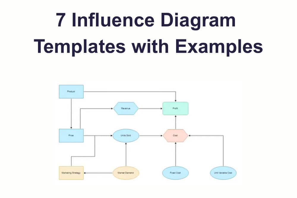
To create an influence diagram, begin by representing the decision as a rectangle, with the variable name clearly written inside. The objective is depicted as an oval, also labeled with the corresponding variable name. Chance or independent variables are illustrated using hexagons, while functions of these variables are represented by rounded triangles. These elements are interconnected with directional lines that indicate how they influence one another.
Example: Consider a scenario where the goal is to predict whether an individual will purchase a product advertised on a social media platform. In this case, two variables are involved: the product’s price and the number of likes it receives on social media. The objective is to develop a model that accurately predicts whether a given individual will make a purchase.
We must identify the factors influencing this decision. In this example, there are three variables: price, number of likes, and the decision to buy. These variables are represented in the model as a rectangle, an oval, and a hexagon, respectively. The relationships between these elements are depicted using directional lines with connectors at each end.
The strength and type of these connections provide additional insights. A heavy line indicates a strong influence, while the direction of the arrow signifies the flow of influence. A half-arrow at one end of the line shows that the influence is unidirectional, whereas a full arrow at both ends indicates a reciprocal relationship between the variables.
In some models, certain elements may be excluded due to their minimal impact on the decision-making process. These are referred to as exogenous variables. Exogenous variables can either be omitted entirely or represented as constants with no effect on the decision. For instance, if the product’s price is deemed irrelevant to the decision of whether an individual will buy it, this relationship can be represented as a constant within the model, depicted by an oval.
Simple Influence Diagram Template Google Docs


Online Tools to Create an Influence Diagram Template
Influence representations are visual tools that depict the various factors impacting a decision. They simplify the understanding of complex scenarios by illustrating how different elements interact and influence one another.
An influence model serves as a business tool that enables analysts to identify and analyze the relationships between positive, negative, or neutral factors that may affect a specific decision. These relationships provide valuable insights into why certain outcomes are more or less likely to occur, based on the values of the input variables.
Unlike decision trees, influence models focus on representing and understanding the interconnections between factors rather than solely emphasizing the outcome. They also provide insights into how these relationships impact results, with aggregated data effectively visualized in influence diagrams.
Influence models are instrumental in creating visual representations of the relationships between various factors affecting a specific outcome. They can address “what if” scenarios, helping stakeholders understand how changes in certain variables impact other elements and the overall outcome. These models not only support decision-making but also aid in strategic planning by offering a comprehensive understanding of the factors influencing a decision.
Lucidchart
Lucidchart – Requires sign-up to edit the influence diagram template for free.

Creately
Creately – This also requires signing up to edit the influence diagram template for free.

Visual Paradigm
Visual Paradigm – Can edit straightaway for free with no signup required.

Smartdraw
Smartdraw – Requires sign-up to use the influence diagram templates for free.

Miro
Miro – Like most of the online tools mentioned above, this requires a sign-up to use the influence diagram template for free.

Choosing Influence Diagram vs. Decision Tree
This diagram is a type of decision tree. They are used to visualize the relationships between variables that influence a specific decision. Decision trees help predict an outcome, given the values of certain variables. Decision trees provide more information than influence diagrams because they use numerical data to determine which variable significantly impacts the final result. Therefore, business analysts need to know when to use a decision tree and an influence diagram.
Both tools allow you to identify the variables that directly or indirectly influence a specific outcome. However, there are differences between them. An influence model is ideal for business problems where identifying ‘if’ questions, i.e., if the price of a product increases, will this affect sales? A decision tree is ideal for business problems where identifying ‘how much’ questions, i.e., by how much would sales decrease if the price of a product increased?
In some scenarios, both influence models and decision trees can be used as analysis tools. In practice, an influence model is more appropriate for identifying cause and effect relationships, whereas a decision tree is ideal for making predictions (i.e., if this happens, then that will happen).
FAQs
What is the use of an influence model/diagram?
This is a visual representation of the different factors that might affect a decision. Therefore, it makes it easier to understand complex situations as you can see which elements influence other aspects of the model.
How do you create an influence model/diagram?
You start by creating your model to add your independent, objective, and function variables. Then you connect the variables with directional lines, trying to understand how they influence one another. Finally, you give each of these connections a name and add annotations so that it is easier for others to interpret the model.
What is an influence model/diagram in project management?
When making decisions, we focus on the primary objective or key variable we aim to achieve (e.g., maximizing net income) while considering the various factors and elements that influence the outcome (e.g., competitor pricing, employee salaries, etc.). Influence diagrams provide a clear and structured way to visualize these relationships, enabling stakeholders to understand how different elements interact and ultimately make more informed and effective decisions.
What is an influence diagram in business analytics?
This diagram represents the relationships between different variables to correctly understand their effects on a specific decision and how they can be used to maximize or minimize an objective. These diagrams are visual models that use shapes and arrows to represent each variable.
Suggested articles:
- 10 Free Perceptual Map Templates
- Top 10 Free Fishbone Diagram Templates
- Stakeholder Cube Templates & Examples
Shane Drumm, holding certifications in PMP®, PMI-ACP®, CSM, and LPM, is the author behind numerous articles featured here. Hailing from County Cork, Ireland, his expertise lies in implementing Agile methodologies with geographically dispersed teams for software development projects. In his leisure, he dedicates time to web development and Ironman triathlon training. Find out more about Shane on shanedrumm.com and please reach out and connect with Shane on LinkedIn.
Really digging this breakdown of influence diagrams! Never realized how useful they could be for mapping out tricky decisions. The social media purchase example made it click for me – might try sketching one for my own project. Totally saving this for reference.