Understanding the difference between run charts and control charts is essential for mastering project quality management. While both tools visualize project data over time, they serve distinct purposes that every project manager should know. Run charts track trends and patterns in process metrics like cycle time and defects, helping you monitor overall performance. Control charts, however, go further by establishing control limits to identify when a process is out of control.
This comprehensive guide breaks down the key differences between these two quality tools, explains when to use each one, and provides the clarity you need to confidently answer PMP exam questions on this topic.
Run Charts and Control Charts in Quality Control
Are you a project manager looking for ways to improve your project quality management process? If so, you may be wondering if run charts or control charts are the right choices for you. Run charts and control charts are both tools that can be used to improve project quality management. However, they are two different tools with different purposes.
- Run charts are used to track the progress of a project over time. They can be used to identify trends and patterns in project data.
- Control charts are used to identify and monitor changes in a process. They can be used to identify special causes of variation in a process.
So, which is right for you? It depends on your project quality management needs. Read on to learn more about run charts and control charts.
What is a Run Chart?
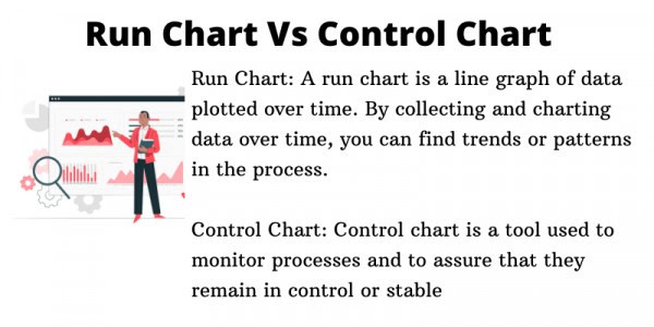
Simply put, the run chart is a line graph that plots data points over time. A run chart is a type of chart that is used to track data over time. It is a valuable tool for project managers, as it can help to identify trends and patterns in the data. This tool can also be used to spot anomalies and outliers, which can be investigated further. It is used to monitor process performance and identify process improvements. It’s also a valuable tool for process improvement because it allows you to see trends and patterns in your data.
Each data point represents the value of a process metric, such as the number of defects per unit. The line on the run chart shows the average value of the metric over time. A run chart is a powerful tool for process improvement because it can help you to:
- See trends in your data
- Identify process improvements
- Monitor process performance
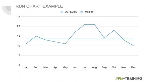
Here’s an example of how a RUN CHART may look:
Why and When to Use a Run Chart
As run charts can be used to track any type of data, they are often used to track quality or process data. As we mentioned, they are a valuable tool because they can help you to see trends and patterns over time. They can also help you to identify potential causes of problems and to track the effects of changes that you make to a process.
There are two main reasons why you would want to use a run chart
- The first is to track the performance of a process over time. This is important because it can help you identify improvements or degradation in the process.
- The second reason is to detect special causes of variation. Special causes are important to identify because they can help you determine the root cause of a problem.
Run charts are a valuable tool for any business that wants to track data over time or detect special causes of variation. By tracking the progress of a project over time, managers can identify when there are issues or roadblocks. Run charts can also help managers see when a project is ahead of schedule or behind schedule.
Components of a Run Chart
There are many different ways to create a run chart, but the basic format is always the same. Run charts always have a time axis and a data axis. The time axis shows when the data was collected, and the data axis shows the values of the data.
There are three components to a run chart:
- Time: The time component is relatively self-explanatory – it simply tracks the passage of time.
- The Process Metric: The process metric is the metric that you are tracking with the run chart. This could be cycle time, number of defects, yield, or any other metric.
- Line With Another Median Line: The line is used to connect the data points on the run chart, and how this goes with the average. In the image, we can see that this is portrayed by the median line.
Interpreting a Run Chart
A run chart is a type of graphical display that shows how a quantity of interest varies over time.
There are three main elements to a run chart:
- The X-Axis: This represents time, and can be divided into equal intervals (e.g., days, weeks, months, etc.).
- The Y-Axis: This represents the quantity of interest.
- The Data Points: These show the actual values of the quantity of interest at each point in time.
To interpret a run chart, you should look for any patterns or trends in the data. These can be either positive or negative and can be either increasing or decreasing. If you spot a pattern or trend, you should then
What is a Control Chart?
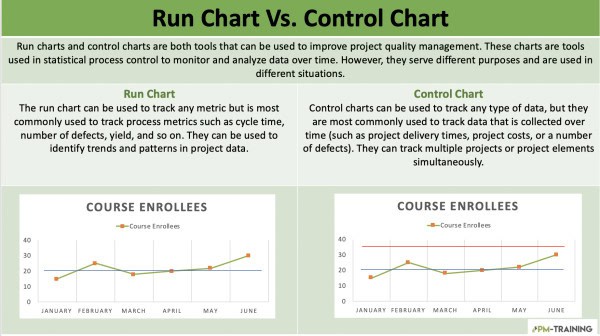
A control chart is a tool used in project quality management to visually track quality metrics over time. By plotting quality data on a control chart, you can identify trends and outliers that can help you assess the current state of your project and make decisions about how to improve quality going forward. Control charts can be used to track any type of data, but they are most commonly used to track data that is collected over time (such as project delivery times, project costs, or a number of defects).
Control charts can be used to track multiple projects or project elements simultaneously. When used properly, control charts can be a valuable tool for project managers. They can help identify problems early so that corrective action can be taken before the problem gets out of control.

Why and When to Use a Control Chart In Project Management
Considering that a control chart is a component of statistical process control or SPC, it gives an insight into a methodology used to identify, understand, and control process variation. There are two types of control charts: attribute control charts and variable control charts.
- Attribute Control Charts: Attribute control charts are used to monitor characteristics of a process that can be counted, such as the number of defects in a manufactured product.
- Variable Control Charts: Variable control charts are used to monitor characteristics of a process that can be measured, such as weight or length.
Control charts are an important tool for quality management and can be used in a variety of different settings, from manufacturing to healthcare.
When Should You Use a Control Chart?
Control charts can be used to monitor any type of project, but they are particularly useful for long-term projects with multiple milestones. There are two main types of control charts: p-charts and c-charts.
- P-Charts: These are used to track the progress of a project over time
- C-Charts: These are used to track the number of defects in a project.
Both types of control charts can be used to identify potential problems and help prevent them from occurring. So why should you use control charts in your project quality management? Here are three reasons:
- Control charts help you track progress.
- Control charts can identify potential problems.
- Control charts help you prevent
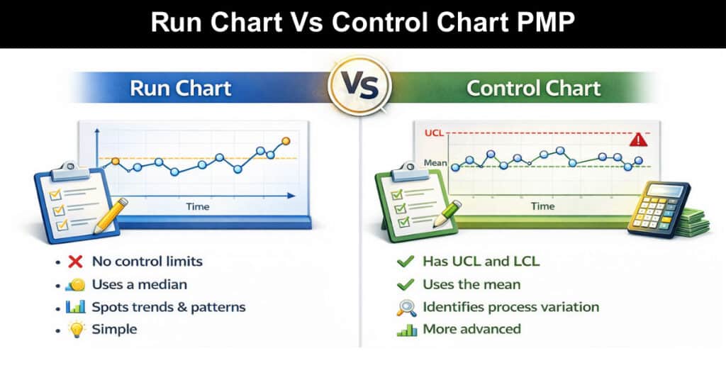
Run Chart vs Control Chart Differences
Both of these methods have their own advantages and disadvantages, so it’s important to understand the difference between them. In general, what would be the difference between a run chart and a control chart?
RUN CHARTS
- Run charts can be used for any type of process and are often used as a first step in the analysis of a process.
- A run chart is simply a graphical representation of how a particular process is performing over time.
- Run charts are great for tracking the overall progress of a project, but they can’t always show small changes.
CONTROL CHART
- Control charts are more detailed and complex than run charts. They are typically used when a process is not in a state of control, and more analysis is needed to understand the cause of the problem.
- A control chart is used to identify whether or not a process is in a state of control.
- Control charts are designed to show small changes and variations.
So, which one should you use for your project? The answer depends on your specific needs. If you need to track the big picture, a run chart is a good choice. But if you need to track small changes, a control chart is a better option.
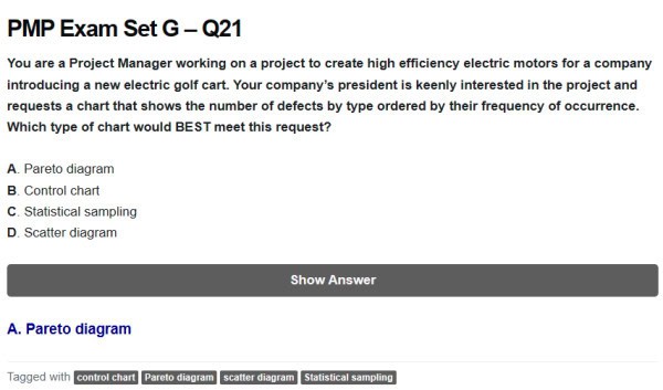
Run Chart Vs Control Chart PMP
These PMP practice questions clarify when to choose run charts, control charts, and other quality tools. Use run charts to spot trends over time and Pareto diagrams to rank defect types by frequency. Use scatter diagrams to check correlations, and control charts (with ±3 sigma limits) to detect process instability—remember the rule of seven. Explore more questions and explanations to master selection and interpretation for the exam.
Video Explaining Run Charts Vs Control Charts
Conclusion
Run charts and control charts are both valuable for tracking process performance over time, but they serve different purposes. Run charts are simple line plots that reveal trends, shifts, and patterns—ideal for quick visual checks and detecting large changes. Control charts add statistical rigor by plotting control limits (typically ±3 sigma) to distinguish common-cause variation from special-cause events, making them better for assessing process stability and signaling when intervention is needed.
Use run charts when you need an easy, fast view of behavior over time; use control charts when you require evidence-based confirmation of whether a process is in control. Selecting the right chart depends on whether you prioritize quick trend visibility or statistical process control.
Frequently Asked Questions (FAQs)
What is a run chart in project management?
A run chart is a graphical representation of how a process changes over time. This is a type of statistical process control chart that is used to track data over time. They are used to look for trends or patterns in data, and they can be used to detect special causes of variation.
What is a control chart in project management?
A control chart is a graphical tool used to analyze data in order to identify trends or patterns. By tracking data over time, control charts can help project managers optimize processes and make informed decisions about how to proceed with a project.
What are the differences between a run chart and a control chart in project management?
Run charts are easy to create and can be used to track any type of data. They can be difficult to interpret and can be misleading if not used properly. Control charts are more complex than run charts, but they offer a more accurate picture of what’s happening as they are typically used to track data that is subject to change, such as the performance of a team or the progress of a project.
Suggested articles:
- Resource Histogram PMP: What It Is & How to Use It
- Quantitative Risk Analysis PMP Overview
- Learning Hack on How to Memorize the PMP Process Chart
Shane Drumm, holding certifications in PMP®, PMI-ACP®, CSM, and LPM, is the author behind numerous articles featured here. Hailing from County Cork, Ireland, his expertise lies in implementing Agile methodologies with geographically dispersed teams for software development projects. In his leisure, he dedicates time to web development and Ironman triathlon training. Find out more about Shane on shanedrumm.com and please reach out and connect with Shane on LinkedIn.