
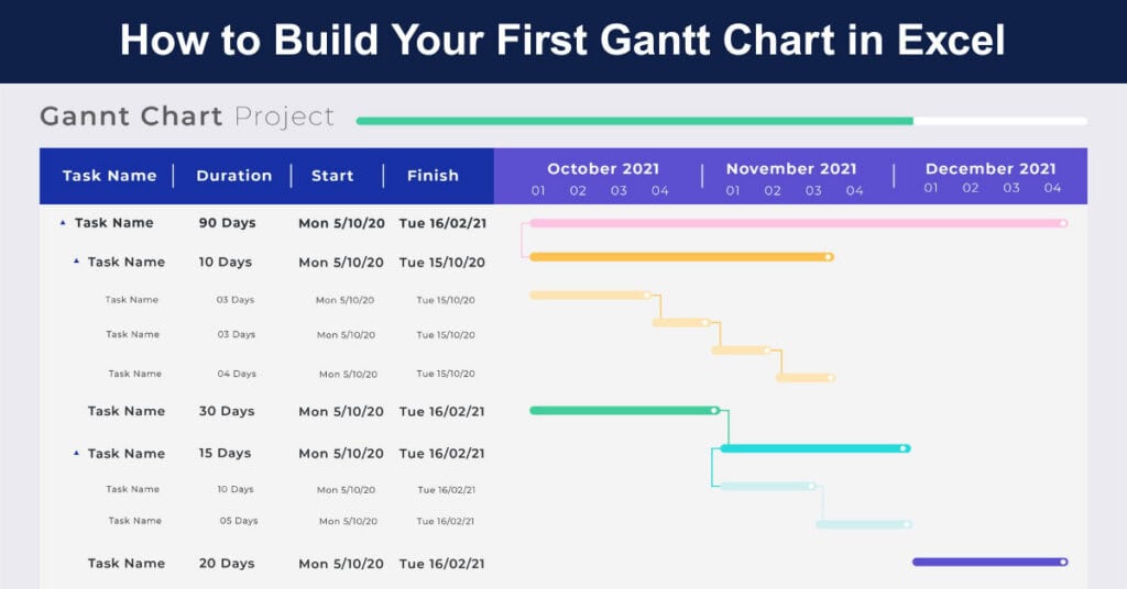
A Gantt chart is one of the most practical tools for organizing and tracking projects. It presents tasks on a timeline, making it easy to see when work begins, how long each activity lasts, and how different tasks fit together. Although many project management platforms can generate Gantt charts automatically, Excel provides a simple and accessible way to build one from scratch. Creating your own chart also helps you understand the fundamentals of project scheduling while improving your spreadsheet skills.
If you are just getting started, building a Gantt chart manually is an excellent learning exercise. It helps you become familiar with Excel’s formulas, charts, and formatting options while creating something genuinely useful.
Start with a Simple Project Table
Begin by opening a new Excel workbook and creating four columns. Label them as Task Name, Start Date, Duration (Days), and End Date. Fill the Task Name column with the activities you want to complete during your project. These might include planning, research, development, testing, or final review. Enter the start date for each task in the Start Date column and specify the expected duration in the Duration column.
The End Date can be calculated using a basic formula that adds the task duration to the starting date. This approach keeps your schedule dynamic, allowing the end dates to adjust automatically whenever you change the duration or starting point of a task. For beginners, using a project with eight to ten tasks is ideal. It provides enough information to understand the process without becoming overwhelming.
Insert a Stacked Bar Chart
Once your project information has been entered, highlight the Task Name and Start Date columns before navigating to the chart section in Excel. Select the Stacked Bar Chart option from the available chart types. Initially, the chart may not resemble a traditional Gantt chart, and that is perfectly normal. At this stage, it is only displaying part of the information required to complete the visualization.
Next, edit the chart’s data so the Duration column becomes a second data series. Right-click the chart, select “Select Data,” and add Duration as a new series. Each task will now contain two connected bars: one representing the starting position and another showing the task’s length. Although the chart still looks incomplete at this stage, the basic structure is now in place.
Turn the Bar Chart into a Gantt Chart
The transformation happens by making the first series invisible. Select the bars that represent the start dates and change their formatting so they have no fill and no border. These invisible bars continue to anchor each task at its correct position on the timeline, while only the duration bars remain visible to the reader.
The visible bars now appear across the timeline exactly where each task is scheduled, giving the chart the familiar appearance of a professional Gantt chart in Excel. This straightforward adjustment demonstrates how standard Excel charts can be creatively customized into powerful project management tools without requiring any additional software or specialized knowledge beyond basic formatting skills.
Organize the Timeline
By default, Excel displays bar charts with the first task appearing at the bottom. To make the project easier to read, reverse the order of the task categories so they appear from top to bottom. You should also adjust the date axis to begin on the first day of your project. This removes unnecessary blank space and creates a cleaner presentation. Setting suitable date intervals, such as weekly markers, also improves readability for longer projects.
Finally, add a meaningful title and choose colors that make the schedule clear without becoming distracting. Limit your palette to two or three complementary shades and use them consistently across similar task categories. A well-labeled chart with thoughtful color choices communicates project timelines at a glance, making it easier for stakeholders to understand the schedule quickly and accurately.
Why Building It Yourself Matters
Creating a Gantt chart manually teaches much more than simply producing a project schedule. You gain a better understanding of how tasks relate to one another, how project timelines are built, and how changing one activity can influence the entire schedule. Recognizing these relationships early helps you make smarter planning decisions. These concepts form the foundation of effective project planning regardless of which software you eventually use.
The process also strengthens your confidence with Excel by encouraging you to work with formulas, charts, dates, and formatting options. Each of these skills plays an important role in day-to-day professional tasks. Whether you are analyzing data, preparing reports, or managing budgets, the techniques you practice while building a Gantt chart are useful in many professional situations beyond project management.
Improve Your Excel Skills Along the Way
As you work through the process, you may notice areas where your Excel knowledge could be improved. Perhaps formulas require extra practice, chart customization feels unfamiliar, or formatting takes longer than expected. This is a natural part of learning. Developing strong spreadsheet skills makes future projects much easier to manage.
A structured learning resource such as Excel courses for beginners can help you build confidence by covering formulas, formatting, charts, and essential spreadsheet techniques in a logical order. These skills also provide a strong foundation for more advanced features, including PivotTables, dashboards, and automated reports. Improving your Excel abilities can benefit professionals in almost every industry, making it a valuable investment for long-term career growth.
Take Your Gantt Chart Further
Once you are comfortable with the basics, your Gantt chart can become much more powerful. You can include a percentage complete column to monitor progress, assign tasks to different team members, and use colors to identify responsibilities. Conditional formatting can automatically highlight overdue activities, making it easier to spot potential delays before they become major issues.
As your experience grows, you can expand your spreadsheet with milestones, dependencies, automated calculations, and summary dashboards. What begins as a simple timeline can gradually develop into a complete project tracking system that supports planning, monitoring, and reporting. By building each feature yourself, you gain practical knowledge that extends well beyond a single project. The experience helps you become more confident using Excel while developing valuable project management skills that can be applied in many different work environments.
Suggested articles:
- Quick Overview of the Best Gantt Chart Software for 2025
- Top 5 Trello Gantt Chart Add-ons
- Top 10 Cons & Disadvantages of Using Gantt Charts

Daniel Raymond, a project manager with over 20 years of experience, is the former CEO of a successful software company called Websystems. With a strong background in managing complex projects, he applied his expertise to develop AceProject.com and Bridge24.com, innovative project management tools designed to streamline processes and improve productivity. Throughout his career, Daniel has consistently demonstrated a commitment to excellence and a passion for empowering teams to achieve their goals.