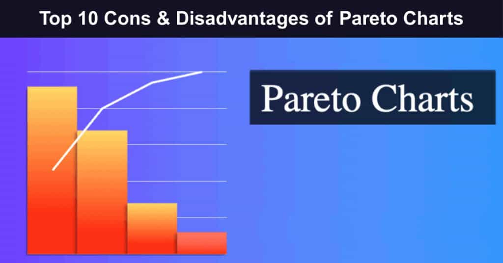
Pareto charts, named for Italian economist Vilfredo Pareto, combine bars (showing individual values in descending order) with a line that represents the cumulative total. They are a powerful visual tool for highlighting the most significant factors within a dataset and are widely used in quality control, project management, and decision-making. However, Pareto charts have important limitations.
The Pareto principle that inspires these charts suggests that a small number of causes often account for a large share of problems, which helps teams focus resources where they can have the greatest impact. That focus can also produce misinterpretation or cause critical information to be overlooked. Moreover, Pareto Charts depend on accurate data collection and thoughtful categorization; they are less effective when data are incomplete, poorly categorized, or difficult to group meaningfully.
Pareto Charts: 10 Drawbacks or Disadvantages
Despite their widespread use and clear benefits across many fields, Pareto charts have limitations that can compromise their effectiveness and the accuracy of the insights they produce. Recognizing these drawbacks is essential for analysts, project managers, and decision-makers to avoid overreliance that could lead to oversight or misdirected efforts. The following section outlines the top 10 cons of Pareto charts and explains why they may not always be the best tool for every data-analysis or problem-solving scenario.
1. Oversimplification of Data
Pareto Charts tend to oversimplify data by condensing complex information into a straightforward visual format. While this simplicity aids clarity, it often comes at the cost of nuance. When dealing with multifaceted issues that require deep, layered understanding, reducing everything to ranked bars can strip away the context that analysts need to make fully informed decisions and develop effective solutions.
Key ways oversimplification harms analysis and decision-making include:
- Loss of Detail: Important details and nuances of data can be lost when condensed into a Pareto Chart, which might lead to overlooking subtle yet significant factors.
- Risk of Misinterpretation: The oversimplified representation of data can result in misinterpretation, where critical issues are underestimated or overlooked entirely.
- Inadequate for Complex Problems: Complex problems involving multiple variables and their interactions may not be adequately addressed by the binary nature of Pareto Charts, necessitating more sophisticated analytical tools.
Real-Life Example: A hospital quality team used a Pareto Chart to address patient complaints and found that “wait times” dominated the chart. They launched a major scheduling overhaul — only to discover the real driver was a billing error affecting specific insurance groups. The chart had grouped these distinct issues under one broad category, masking the true root cause and misdirecting months of improvement efforts.
Resolution: To counter oversimplification, analysts should treat Pareto Charts as a starting point, not a final answer. Supplement them with cause-and-effect diagrams, detailed root cause analyses, or drill-down charts that break broad categories into subcategories. Pair the visual with narrative context and domain expertise so that critical nuances are preserved, and decision-makers aren’t misled by an overly tidy picture.
2. Focus on Frequency Over Severity
One of the most consequential limitations of Pareto Charts is their default tendency to rank issues by how often they occur rather than by how much damage they cause. This frequency-first lens can systematically push rare but catastrophic problems to the bottom of the chart, leaving teams optimizing for minor inconveniences while serious risks fester unaddressed in the background of operations.
Specific ways frequency bias distorts priorities and resource allocation include:
- Neglect of Critical Issues: Severe issues that occur less frequently may be deprioritized, even if their impact on the system or process is substantial.
- Misallocation of Resources: Resources might be directed towards addressing frequent but less impactful problems, leading to inefficient use of time and effort.
- Skewed Priority Setting: The focus on frequency can skew priorities, leading organizations to address symptoms rather than root causes of significant issues.
Real-Life Example: An airline’s maintenance team charted recurring issues and found minor cabin lighting faults at the top, while rare hydraulic anomalies appeared near the bottom. Resources were funneled into lighting repairs. Several months later, a hydraulic-related incident grounded multiple aircraft, triggering costly inspections and regulatory scrutiny — a consequence that a severity-weighted analysis would likely have flagged much earlier.
Resolution: Analysts should augment frequency-based Pareto Charts with a severity or impact weighting system. By multiplying occurrence frequency by a risk or cost score, teams can build a weighted Pareto that surfaces high-severity, low-frequency problems. Additionally, a separate chart ranking issues purely by severity — independent of frequency — should be reviewed alongside the standard chart before any resource allocation decisions are finalized.
3. Limited to Qualitative Data
Pareto Charts perform best when data can be neatly grouped into distinct, named categories such as defect types, complaint reasons, or error sources. When the underlying data is numerical or continuous, such as temperature readings, processing times, or financial metrics, forcing it into categorical buckets often distorts the picture, reducing precision and creating artificial groupings that don’t reflect the actual distribution of the data.
The core limitations when applying Pareto Charts to quantitative datasets include:
- Inapplicability to Quantitative Analysis: Challenges arise when applying Pareto Charts to quantitative data, which may require different statistical analysis methods.
- Limited Scope of Use: The effectiveness of Pareto Charts is confined to scenarios where data can be easily categorized, excluding a broad range of quantitative problems.
- Difficulty in Handling Continuous Data: Continuous, numerical data sets are difficult to categorize effectively for Pareto analysis, often requiring additional preprocessing steps.
Real-Life Example: A manufacturing plant tried using a Pareto Chart to analyze machine downtime measured in minutes across dozens of incidents. To fit the format, engineers bucketed times into ranges (e.g., 0–10 min, 10–30 min), but the arbitrary boundaries obscured meaningful patterns. A histogram and regression analysis later revealed a bimodal distribution tied to shift changes — a finding entirely invisible in the Pareto format.
Resolution: When working with continuous or quantitative data, analysts should opt for statistical tools better suited to numerical distributions, such as histograms, scatter plots, control charts, or regression analyses. If a Pareto is still desired, invest time in thoughtful, domain-informed binning that reflects natural breakpoints in the data. Documenting how bins were created ensures transparency and allows others to critically evaluate the categorization choices made.
4. Assumes 80/20 Distribution
The intellectual foundation of Pareto Charts rests on the 80/20 rule — the idea that roughly 80% of outcomes stem from 20% of causes. While this principle holds in many real-world scenarios, it is far from universal. Blindly applying this assumption to datasets that follow different distributions leads analysts to frame their findings in a way that doesn’t actually match the underlying data, resulting in misplaced confidence and flawed strategic decisions.
The core risks of anchoring analysis to the 80/20 assumption include:
- Not Universally Applicable: The 80/20 distribution is an assumption that does not hold for all types of data or situations, potentially leading to incorrect conclusions.
- Risk of Overgeneralization: Relying on the 80/20 rule can result in overgeneralization and neglecting significant factors that do not fit this distribution.
- Misguided Decision Making: Decisions based on the assumed 80/20 distribution may misdirect efforts towards areas that are not as impactful as believed, reducing the effectiveness of interventions.
Real-Life Example: A retail company analyzed customer returns, expecting the 80/20 rule to hold — assuming a handful of product types would dominate. Instead, returns were spread nearly evenly across 15 categories, each contributing 5–8%. Treating the top few as if they represented 80% of the problem led to targeted fixes in isolated areas while the actual systemic issue — a confusing returns policy — went untouched for another quarter.
Resolution: Before concluding a Pareto Chart, analysts should verify whether an 80/20 pattern actually exists in the data by examining cumulative percentage lines carefully. If the distribution is relatively flat or doesn’t show a clear “vital few,” acknowledge this in the analysis and consider alternative frameworks such as uniform prioritization, weighted scoring matrices, or multi-criteria decision analysis that don’t presuppose any particular distribution pattern.
5. Difficulty in Identifying Complex Relationships
Pareto Charts excel at ranking discrete causes by their individual contribution, but are fundamentally ill-equipped to reveal how those causes interact with one another. In real-world systems, problems rarely have single, isolated causes — they emerge from interconnected variables that amplify or suppress each other. This limitation makes Pareto Charts a poor standalone tool when the goal is to understand systemic dynamics rather than simply rank surface-level symptoms.
The main ways Pareto Charts fall short when relationships between variables matter:
- Simplistic Analysis: They provide a simplistic view that may not capture the complexity of specific issues where multiple causes contribute to a problem.
- Lack of Depth in Analysis: The charts do not facilitate the exploration of how different factors influence each other, which is critical for solving complex issues.
- Ineffective for Multivariate Problems: For problems that involve multiple variables and their interactions, Pareto Charts fall short, necessitating more sophisticated analytical tools that can handle multivariate analysis.
Real-Life Example: A software company used a Pareto Chart to address user churn and identified “slow load times” as the top factor. Development teams optimized server response aggressively — but churn barely moved. A subsequent multivariate analysis revealed that slow load times only caused churn when combined with poor onboarding experiences. Addressing the interaction between the two variables, not just the top-ranked one, finally produced meaningful retention improvements.
Resolution: Complement Pareto Charts with tools that uncover relationships between causes — such as fishbone (Ishikawa) diagrams, correlation matrices, multivariate regression, or systems thinking maps. These approaches help teams move beyond surface-level rankings to understand how factors interact. Using Pareto Charts to identify candidates for deeper investigation, rather than as a definitive guide to action, strikes the right methodological balance.
6. Static Representation
A Pareto Chart captures a static snapshot of data, presenting the distribution of causes or issues as they existed during a defined data collection window. In environments where conditions shift rapidly — markets fluctuating, processes evolving, or external factors changing — a chart built on last quarter’s data may paint a completely inaccurate picture of today’s reality, leading teams to prioritize issues that have already resolved while ignoring newly emergent ones.
The core consequences of Pareto Charts’ static, point-in-time nature include:
- Limited Use in Dynamic Environments: Pareto Charts can quickly become outdated in settings where data changes frequently, requiring constant updates to remain relevant.
- Inability to Track Changes Over Time: They do not inherently track progress or changes over time, making them less suitable for long-term trend analysis or continuous improvement efforts.
- Need for Regular Updates: Pareto Charts must be regularly updated to maintain accuracy and relevance, which can be resource-intensive in fast-paced or rapidly changing scenarios.
Real-Life Example: A logistics company built a Pareto Chart in January, identifying “driver shortages” as the dominant cause of delivery delays. By March, seasonal hiring had resolved most staffing issues, but teams were still executing the January action plan. Meanwhile, a new routing software bug had emerged as the leading delay cause — something the outdated chart completely missed, costing the company weeks of misdirected troubleshooting effort.
Resolution: Organizations should establish a regular cadence for refreshing Pareto Charts — weekly, monthly, or quarterly, depending on how quickly their operating environment changes. Better still, integrate Pareto analysis into live dashboards that automatically update as new data flows in. Pairing the chart with trend lines or time-series overlays allows teams to see not just the current ranking but also whether the relative importance of each issue is growing, shrinking, or stable.
7. Not Suitable for All Types of Data
While Pareto Charts thrive when a clear hierarchy exists among a manageable set of distinct categories, they quickly lose their utility when that condition isn’t met. Data where many categories compete at similar frequencies, or where all issues genuinely require simultaneous attention, doesn’t produce the dramatic “vital few” visual separation that gives Pareto Charts their analytical value. In such cases, the chart may actually mislead by implying a prioritization structure that the data doesn’t support.
Situations where data characteristics make Pareto Charts particularly problematic or misleading:
- Equally Important Issues: In scenarios where all issues need simultaneous attention, Pareto Charts’ focus on prioritizing certain issues can be misleading.
- Large Number of Similar Categories: When many categories exist with similar frequencies, distinguishing between them becomes challenging, reducing the chart’s utility.
- Difficulty with Diverse Data Sets: Pareto Charts may not accurately represent data sets that do not fit neatly into distinct categories, limiting their usefulness in varied analytical contexts.
Real-Life Example: A city government analyzed 20 types of infrastructure maintenance needs using a Pareto Chart. The resulting chart showed all 20 categories clustered within a narrow frequency range — roads at 8%, bridges at 7%, parks at 6.5%, and so on. The near-uniform distribution offered no actionable prioritization signal, yet the visual format implied that roads were vastly more important, nearly causing unjustified budget cuts to other equally critical services.
Resolution: Before defaulting to a Pareto Chart, examine whether a meaningful frequency hierarchy actually exists in the data. If the distribution is relatively flat, consider alternative visualization methods such as ranked dot plots, heat maps, or radar charts that better represent situations of comparable importance. For truly equal priorities, a balanced resource allocation matrix or multi-criteria scoring approach may provide more honest and actionable guidance than a ranking-oriented format.
8. Requires Accurate Categorization
The analytical power of a Pareto Chart is only as strong as the accuracy of the categories used to organize its data. How data is labeled, grouped, and defined at the collection stage directly determines what the chart ultimately reveals or conceals. Vague, inconsistent, or poorly thought-out categorization schemes can cause fundamentally similar issues to be counted separately or genuinely distinct problems to be collapsed together, undermining the entire analysis before a single bar is drawn.
The main challenges and risks that poor categorization introduces into Pareto analysis:
- Dependence on Data Quality: The utility of Pareto Charts is compromised if the underlying data is inaccurately categorized or of poor quality.
- Potential for Misleading Insights: Inaccurate categorization can lead to incorrect prioritization of issues, potentially misleading decision-making processes.
- Challenges in Data Preparation: Effective use of Pareto Charts requires substantial upfront work in data preparation and categorization, which can be a significant limitation in terms of time and resources.
Real-Life Example: A call center tracked customer complaints using a Pareto Chart but allowed agents to self-select from 30 overlapping categories. “Billing issues,” “payment problems,” and “invoice questions” were listed separately, each appearing mid-chart; when combined, they would have overwhelmingly dominated. Leadership addressed “hold time” — the chart’s top category — while the real systemic driver, a billing system overhaul, was never identified or escalated.
Resolution: Invest significant effort in building a clean, mutually exclusive, and exhaustive categorization taxonomy before data collection begins. Standardize definitions, provide clear examples for each category, and train all data collectors consistently. Conduct periodic audits of categorization decisions to catch drift over time. When historical data has inconsistent labels, a data cleaning and recategorization phase should precede any Pareto analysis to ensure the resulting chart reflects reality accurately.
9. Can Lead to Neglect of Less Frequent Issues
The defining feature of Pareto analysis, its singular focus on the “vital few,” is also one of its most dangerous tendencies when applied without critical oversight. By design, the chart directs attention and resources toward the most frequent or visible problems, which means the long tail of less common issues is routinely minimized or ignored. Yet it is often within this overlooked tail that early warning signals, rare catastrophic risks, and emerging systemic problems quietly accumulate.
Key reasons why neglecting low-frequency issues can have serious consequences:
- Overlooked Emerging Trends: Less frequent issues might be early indicators of emerging trends or problems that require attention before they become more significant.
- Neglect of Significant but Infrequent Problems: Infrequent issues with potentially severe consequences might be deprioritized or ignored altogether.
- Incomplete Problem Resolution: By focusing only on the most common issues, organizations might miss the opportunity to address the problems affecting a process or system.
Real-Life Example: A pharmaceutical manufacturer used Pareto Charts to guide quality reviews and consistently focused resources on the top five defect types. A rare but recurring contamination event appeared so infrequently that it never cracked the top ten. Eighteen months later, this minor anomaly had evolved into a widespread contamination issue requiring a full product recall — a costly outcome that earlier investigation of tail-end issues could have prevented.
Resolution: Establish a formal review process specifically designed to evaluate low-frequency issues flagged in the Pareto tail. Assign risk severity scores to these issues independent of their frequency, and trigger automatic escalation protocols when any low-frequency issue crosses a defined severity threshold. Conduct periodic “long tail reviews” where teams specifically examine the bottom portion of the Pareto Chart rather than treating it as irrelevant background noise in their quality improvement process.
10. Skill and Experience Required
Despite their visually straightforward appearance, Pareto Charts demand a level of statistical literacy, analytical judgment, and contextual awareness that many users underestimate. Creating an accurate chart requires sound data collection design and thoughtful categorization. Interpreting one correctly demands understanding its assumptions, limitations, and the specific context of the data. Without this combination of skills and experience, Pareto Charts can generate false confidence and costly analytical errors.
The core skill-related challenges that limit Pareto Charts’ effectiveness in practice:
- Need for Expertise: Effective use of Pareto Charts demands understanding statistical principles and data analysis techniques.
- Risk of Misinterpretation: Inexperienced users may misinterpret the data presented in Pareto Charts, leading to incorrect conclusions and potentially costly mistakes.
- Training and Experience: Organizations must invest in training and developing the analytical skills of their staff to ensure Pareto Charts are used effectively, which can be a barrier to quick implementation.
Real-Life Example: A mid-size manufacturing firm rolled out Pareto Charts across all departments after a brief training session. Within weeks, a procurement manager interpreted a chart showing supplier-related defects and concluded that the top-ranked supplier should be dropped immediately. A senior analyst later identified that the chart’s top category was an artifact of poor data entry conventions, not a genuine supplier performance issue — the misread nearly ended a valuable long-term partnership.
Resolution: Organizations should invest in structured training programs that go beyond chart creation to cover interpretation, limitation awareness, and integration with complementary tools. Establishing peer review requirements — where Pareto analyses are vetted by an experienced analyst before influencing decisions — adds an important quality checkpoint. Creating standardized templates with built-in guidance notes and annotation requirements also helps less experienced users avoid the most common interpretive mistakes.
Conclusion
While widely celebrated for their ability to simplify data analysis and highlight significant issues, Pareto Charts have a range of limitations that can impact their effectiveness in specific contexts. The inclination to streamline complex data excessively, prioritize frequency over impact, and rely on the 80/20 rule can result in misaligning priorities and the oversight of significant yet infrequent problems.
Additionally, their static nature and lack of suitability for all data types further restrict their applicability. Understanding these disadvantages is essential for analysts and decision-makers to ensure that reliance on Pareto Charts does not lead to oversight or misdirected efforts in addressing problems.
Suggested articles:
- Top 10 Cons & Disadvantages of Monte Carlo Analysis
- Top 10 Cons & Disadvantages of Using Gantt Charts
- Run Chart Vs Control Chart PMP
Daniel Raymond, a project manager with over 20 years of experience, is the former CEO of a successful software company called Websystems. With a strong background in managing complex projects, he applied his expertise to develop AceProject.com and Bridge24.com, innovative project management tools designed to streamline processes and improve productivity. Throughout his career, Daniel has consistently demonstrated a commitment to excellence and a passion for empowering teams to achieve their goals.