
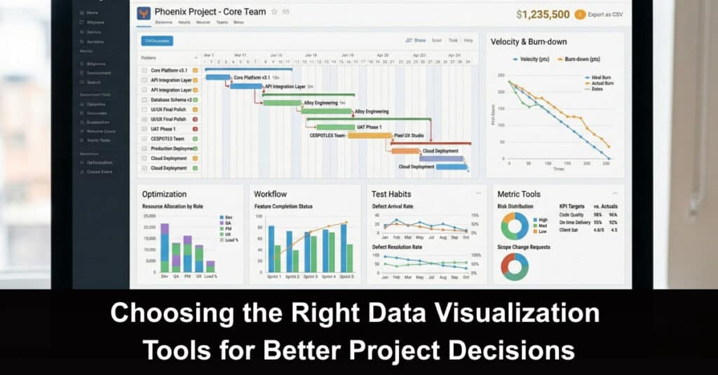
Modern projects generate more data than most teams can comfortably interpret. Budgets, schedules, resource levels, customer feedback, operational risks, and performance indicators may all be available, yet access to information does not automatically produce better decisions. When data is presented poorly, important patterns remain hidden, and teams may focus on numbers that look impressive but have little practical meaning.
Data visualization tools help convert complex information into charts, dashboards, and reports that people can understand quickly. The right platform can reveal delays, unusual cost movements, declining performance, or relationships between activities that would be difficult to recognize in a spreadsheet.
Choosing such a tool, however, involves more than selecting the platform with the longest feature list. Project teams need to consider their audience, data sources, analytical requirements, collaboration habits, and technical capacity. A simple reporting tool may be more valuable than an advanced platform that few people know how to use.
Begin With the Decisions the Visuals Must Support
Teams often choose software before defining the questions they need their data to answer. This can result in attractive dashboards that provide information without helping anyone decide what to do next. A selection process should start with project decisions, so visuals directly support action. A manager may need deadline realism, resource strain, and best budget adjustment, while teams need task detail and stakeholders need progress, cost, and risk.
Clarify decisions, then choose visuals that answer them quickly:
- Decision-First Selection: Define Questions Before Tools: Teams often choose software before the questions are clear, creating dashboards that look good but don’t help teams decide what to do next.
- Translate Decisions Into Required Views: Start with decisions made during the project. Managers need deadline realism, which workstream consumes more resources than planned, and where budget changes matter most; teams need task detail; stakeholders need progress, cost, and risk summaries.
- Apply the Same Principle in Financial Analysis: Financial analysis reinforces the logic. Resources available through https://www.vectorvest.com/ compare charting and analysis platforms by technical analysis capabilities, screening features, market coverage, alerts, and ease of use.
- Match Tool Purpose to Reporting Needs: A tool designed for exploratory analysis may not be the best fit for weekly executive reporting. Defining required decisions first helps prevent unnecessary spending and excessive complexity.
Match the Visualization Type to the Information
Different chart formats answer different questions. Use a line chart to show how spending, workload, or performance changes over time, and bars to compare categories like departments or project phases. Scatter plots can suggest whether two numerical factors relate, while timelines or Gantt charts communicate dependencies and scheduled activity.
Choose the right format so the message stays clear and accurate:
- Use Charts That Fit the Question Being Asked: Line charts show trends over time, bar charts make category comparisons easier, scatter plots reveal relationships, and timelines or Gantt charts communicate dependencies and scheduled activity.
- Avoid Visual Formats That Distort Meaning: A pie chart with many categories becomes hard to interpret, and 3D charts can make values seem more dramatic without adding insight. Over-decorated dashboards can also distract from the indicators that require action.
- Prefer Simplicity and Clear Visual Design: Select the simplest visual that still communicates the needed insight. Keep labels readable, use consistent units, and apply color purposefully instead of using it only for decoration.
- Provide Context for Every Key Metric: Showing $150,000 spent means little without the approved budget, expected progress, or spending from a comparable period. Effective visualization helps viewers understand both the current value and whether it signals strong performance or an emerging problem.
Check Data Integration and Automation Capabilities
A data visualization platform is only as useful as the data it receives. Before adopting a tool, confirm it connects reliably with the systems already used for project management, finance, customer relationships, time tracking, and operational reporting. Check that sync is automated, refresh timing is clear, mappings are correct, and data stays consistent—so dashboards reflect reality, not manual or delayed imports.

Focus on reliable data flow before optimizing dashboards:
- Confirm Reliable Connections to Existing Systems: Teams should determine whether the platform connects consistently with project management, finance, customer relationships, time tracking, and operational reporting.
- Reduce Risk From Manual Data Transfers: Manual transfers may work for a small one-time project, but they become riskier as reporting frequency and complexity grow. Copying between spreadsheets can introduce errors, create outdated dashboards, and consume time better spent interpreting results.
- Use Automation With Clear Controls: Automated connections can refresh visualizations whenever underlying information changes, improving consistency. Teams should also know when data was last updated, which source supplied each metric, and whether any transformation happened before appearing on the dashboard.
- Assess Data Volume, Structure, and Team Skills: The platform should handle the volume and structure of available information. Some tools struggle with large databases or multi-system data, while others require technical specialists. Integration features are limited in value if no one can manage them confidently.
Consider Collaboration, Access, and Governance
Project decisions rarely happen in isolation. Data may need review by internal teams, executives, clients, suppliers, or external partners, so the tool should enable sharing the right information without exposing confidential material. Cloud platforms can support collaboration and controlled access, helping stakeholders work from the same dashboard.
Set up sharing and rules so everyone can trust what they see:
- Make Sharing Easy Without Exposing Confidential Data: The chosen data visualization tool should support sharing appropriate information with internal teams, executives, clients, suppliers, and external partners while protecting confidential material.
- Leverage Collaboration Features With Controlled Access: Cloud-based platforms often offer real-time collaboration, comments, shared dashboards, and permission-based access. These features reduce reliance on emailed report versions and ensure stakeholders see the same information with the right filters.
- Strengthen Governance for Sensitive Data: Governance becomes especially important when dashboards include financial data, employee information, customer records, or strategic plans. Teams should review permission settings, authentication options, data storage policies, and whether changes can be tracked.
- Align Definitions So Metrics Stay Consistent: Without agreed definitions, different departments may calculate metrics in different ways. A visualization tool cannot resolve that disagreement alone, so organizations should create shared definitions and document the source behind each measure to maintain consistent underlying rules.
Test Usability Before Making a Long-Term Commitment
A tool can look impressive in a sales demo but feel frustrating in day-to-day reporting. Before committing, run a hands-on trial with your own data and real workflows, including filter use, refresh timing, and export needs. Test with the actual people who will publish and interpret dashboards, and confirm it supports your cadence, governance, and decision-making style.
Validate usability and total cost before you scale:
- Run a Pilot to Measure Real-World Performance: A pilot can reveal how long it takes to create and update dashboards, whether nontechnical employees can apply filters correctly, and how easily stakeholders can share or access reports.
- Identify Practical Limitations Early: Pilots can expose limitations involving exports, mobile access, calculation methods, and data refresh schedules—issues that may not appear during early demos.
- Evaluate Full Cost Beyond Subscription Price: Cost should be assessed beyond the advertised subscription. Training, implementation, data preparation, additional connectors, specialist support, and premium licenses may substantially increase total expense.
- Plan for Growth as Requirements Expand: Teams should consider whether the tool can scale. A small project may start with basic charts, but later needs could include portfolio reporting, predictive analysis, or integration with more complex systems.
Conclusion
Modern projects generate more data than most teams can comfortably interpret—across budgets, schedules, resources, customer feedback, risks, and performance metrics. Having information isn’t the same as making better decisions. When dashboards and reports are confusing or poorly designed, key patterns stay hidden, and teams may spend time debating numbers that look impressive but don’t translate into action.
Data visualization tools help turn complex inputs into clear charts, dashboards, and summaries that people can understand quickly. The right visualization approach can reveal delays, unusual cost movement, declining performance, and meaningful relationships between activities that are hard to spot in spreadsheets. Choosing the right tool also means matching it to your audience, data sources, workflow, and analysis needs—not just picking the one with the longest feature list.
Suggested articles:
- Data-Driven Project Management: Strategies for Smarter Decisions
- How to Create Effective Dashboards with Figma
- Comparative Analysis: Kibana vs. Grafana

Daniel Raymond, a project manager with over 20 years of experience, is the former CEO of a successful software company called Websystems. With a strong background in managing complex projects, he applied his expertise to develop AceProject.com and Bridge24.com, innovative project management tools designed to streamline processes and improve productivity. Throughout his career, Daniel has consistently demonstrated a commitment to excellence and a passion for empowering teams to achieve their goals.