Google returns over 13 million pages describing project status reports. Read through them, and you will find extensive discussions on purpose, key components, and countless templates. This article cuts through that noise by presenting three practical visual reporting formats you can incorporate directly into your project or programme status report deck. The goal is simple: use visuals to convey status rather than relying on lengthy written summaries that few stakeholders will read in full.
Most people skim status reports rather than read every word. You have likely witnessed an executive or key stakeholder flip through a meticulously worded presentation only to pause at the one slide that captures their attention. The entire purpose of a status report is to inform stakeholders about progress and facilitate honest conversation around scope, resources, and timelines. Visual formats make that conversation significantly easier for both the presenter and the audience.
Why Visual Reporting Matters
My unscientific observation is that people skim rather than read an entire status report or presentation. Clark Campbell even wrote two books on the subject, using a one-page format for both IT and non-IT projects. Be sure to check out The One-Page Project Manager: Communicate and Manage Any Project With a Single Sheet of Paper and The One Page Project Manager for IT Projects. A one-page visual format may not meet every stakeholder communication need, but the three formats below address a wide range of situations and consistently improve how project status is understood and discussed.
Each visual format serves a distinct communication purpose depending on your audience and project complexity:
- Colour-Coded WBS: Applies status indicators directly to deliverables, allowing stakeholders to identify problem areas across the entire project at a glance without reading a single line of prose.
- Graphical Timeline View: Presents a time-phased snapshot of key milestones and tasks, helping audiences quickly assess whether the project is on track against its original schedule.
- One-Page Combined Report: Merges subjective commentary with objective performance metrics such as SPI and CPI, giving stakeholders a comprehensive and balanced view of overall project health.
Work Breakdown Structure Project Status Report
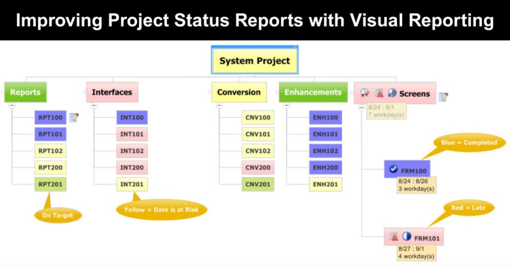
The work breakdown structure approach overlays colour-coded status indicators directly onto your project deliverables, making it one of the fastest ways to communicate project health. The figure below depicts all the reports, interfaces, conversion programmes, enhancements, and forms required to be developed in a systems project. Each deliverable in the WBS is colour-coded based on progress, issues, and risks, and the colour convention follows a straightforward logic that any stakeholder can immediately interpret.

Figure 1 – Visual Status Reporting using a WBS
A glance at the graphical WBS immediately reveals where the project’s most significant problems are concentrated, without requiring the audience to interpret a paragraph of prose. In the example below, the interfaces and screen development branches carry the highest number of problems, while the conversion branch is also flagged as at risk. By adding this visual layer, project teams can rapidly focus attention on the areas affecting impacted work.
The colour-coding system used in the WBS follows a consistent and intuitive convention throughout the report:
- Blue: Indicates a fully completed deliverable, confirming that the task has been closed and requires no further attention from the project team.
- Green: Signals that the task is progressing on schedule, with no current risks or issues requiring escalation to project leadership.
- Yellow: Flags an at-risk deliverable that requires monitoring, indicating potential issues that could affect the timeline if left unaddressed.
- Red: Marks a late deliverable that has already breached its deadline, requiring immediate intervention and a clear recovery plan.
The graphical WBS shown in Figure 1 was developed in Mindjet MindManager. Using MindManager, project managers can import MS Project data, assign task start and end dates, and display red and yellow indicators based on the current date. This format is particularly effective on larger programmes where summarising the status of complex, multi-workstream projects in a single view would otherwise require several slides of text.
A Graphical Timeline View
Every project status report needs a time-phased Gantt chart to indicate progress against due dates. Before MS Project 2010, Gantt chart reporting was difficult because producing a meaningful one-page graphical view required significant manual effort. MS Project 2010 introduced a timeline view that allows project managers to add only select tasks and milestones, rather than every line in the schedule, making the output far cleaner and more stakeholder-ready.
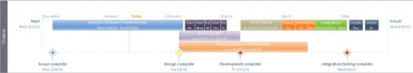
Figure 2 – Microsoft Project Timeline
The timeline view is helpful for many projects, but large-scale programmes often span multiple workstreams and phases that require a fully integrated view. Microsoft Project users can create multiple timeline views and embed them in a single PowerPoint slide, or build a manual Gantt chart in Visio or Excel. Alternatively, you can download pre-designed timeline templates for PowerPoint & Google Slides. The challenge with these approaches is that any change to the underlying project data demands tedious graphic manipulation.
For a configurable, one-page snapshot that stays connected to your project schedule, the Chronicle Graphics OnePager Pro tool is worth exploring. OnePager Pro delivers several practical advantages over manual Gantt chart construction in standard office tools:
- Automated Data Updates: When the underlying MS Project schedule changes, a single button click refreshes the entire graphical output, eliminating the need for manual bar adjustments or reformatting.
- Baseline Reporting: Project managers can display the original project baseline alongside current progress, giving stakeholders an immediate visual reference for how far the project has drifted from its original plan.
- Critical Path Visualisation: The tool highlights the critical path directly within the timeline, making it straightforward to identify which tasks are driving the project end date and where schedule risk is concentrated.
- Custom Annotations: Teams can add commentary, callouts, or flags directly onto the timeline graphic, providing context for key decisions or delays without needing to switch to a separate slide.
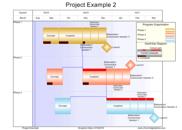
Figure 3 – Chronicle Graphics Visual Status Report
My One-Page Project Status Report
If only one slide could be included in a status reporting deck, this is the format to choose. It combines text and graphical indicators across both subjective sections and objective metrics such as the Schedule Performance Index (SPI) and the Cost Performance Index (CPI). By consolidating achievements, top issues, risks, and schedule status into a single view, stakeholders receive a comprehensive picture of the project without needing to navigate multiple slides.
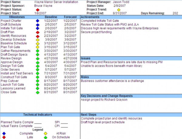
One Page Status Report Example
This project status report template scales effectively across small projects, large projects with several workstreams, and major programmes with many sub-projects. By dedicating one page to each workstream, the project manager maintains a consolidated view of all active work. As new scopes or phases are added, an additional one-page sheet is simply appended to the reporting deck, keeping the structure consistent and easy to navigate.
Assembling the Status Report Deck
Once the individual one-page snapshots are ready, they are assembled into a single Microsoft PowerPoint presentation. The recommended slide order provides a clear, progressive narrative for your stakeholders to follow. For each project within a programme, additional one-page status reports are added in the same format, with slide selection adjusted based on your audience’s specific needs and the level of detail required for informed decision-making.
The following order provides a logical and audience-friendly structure for the final deck:
- Title Slide with date and presenter
- Status-Based WBS (Figure 1)
- Graphical Timeline View (Figure 2 or 3)
- One Page Status Report (Figure 4)
- Appendix
- Detailed Issue, Risk Log
- Summarize Project Schedule
- Budget Detail
Maximising the Impact of Visual Status Reports
Adopting a visual reporting format is a meaningful first step, but the real value emerges when the format is used consistently and refined over time. Project managers who commit to a visual approach often find that stakeholder engagement improves quickly, as audiences begin to trust the format and know exactly where to look for the information they need. Consistency in layout, colour conventions, and reporting cadence builds that trust more effectively than any single, well-designed slide.
Beyond consistency, the most effective visual reports are tailored to the audience receiving them. An executive sponsor requires a different level of detail than a workstream lead or a delivery team member. Consider maintaining a core one-page format as the centrepiece of every reporting deck, while supplementing it with audience-specific views such as a detailed risk log for operational stakeholders or a high-level milestone summary for senior leadership. Customisation does not require rebuilding the report from scratch; it simply means selecting the right layers of information for each conversation.
The following principles help project managers get the most from visual status reporting over time:
- Standardise Colour Conventions: Use the same colour-coding logic across every report and every project to ensure stakeholders interpret status indicators correctly without needing to re-read the legend each time.
- Limit Slide Count: Resist the temptation to add slides for every data point. A concise deck of four to six visual slides consistently outperforms a twenty-slide report packed with tables and bullet-heavy text.
- Seek Stakeholder Feedback: After each reporting cycle, ask one or two key stakeholders whether the format gave them the clarity they needed. Small adjustments based on direct input improve the report faster than any internal review process.
- Refresh Data Before Every Meeting: A visual report loses credibility instantly if the data is stale. Build a pre-meeting data refresh into your standard reporting workflow so the visuals always reflect the current state of the project.
Conclusion
Visual reporting transforms project status updates from dense, text-heavy documents into clear, accessible snapshots that stakeholders can absorb at a glance. Whether you use a colour-coded WBS, a graphical timeline, or a one-page combined format, each approach reduces the time stakeholders spend interpreting data and increases the quality of the conversations that follow. The right format depends on project complexity, audience preferences, and the level of detail required.
Start by selecting one of the three formats presented in this article and piloting it in your next status reporting cycle. Gather feedback from your key stakeholders and refine the format to suit your organisational context. Visual communication is a skill that improves with practice, and even a modest improvement in how you present project status can meaningfully strengthen stakeholder trust and project outcomes.
FAQs About Project Status Reports
What is a visual project status report?
A visual project status report uses graphical elements such as colour-coded work breakdown structures, Gantt charts, and combined one-page formats to communicate project progress clearly. Instead of relying on lengthy written summaries, visual reports allow stakeholders to absorb key information quickly and focus conversations on areas that need attention.
Why should project managers use visual status reports?
Visual status reports improve comprehension by presenting complex project data in a format that is easier to scan and interpret. Stakeholders, including executives and clients, are more likely to engage with a well-designed visual format than with dense paragraphs of text, making meetings more productive and decisions better informed.
What tools can I use to create a graphical WBS status report?
Mindjet MindManager is a widely used tool for creating graphical work breakdown structures. It allows project managers to import MS Project data, assign task dates, and apply colour-coded status indicators automatically. Other tools, such as Lucidchart and Miro, also support WBS visualisation and can be configured to reflect project status.
What is OnePager Pro, and how does it help with timeline reporting?
OnePager Pro, developed by Chronicle Graphics, is a tool that generates a configurable one-page project timeline snapshot directly from MS Project data. It supports baselines, critical path visualisation, percentage complete indicators, and custom annotations. When project data changes, the timeline updates automatically, saving project managers significant time compared to manual chart editing in PowerPoint.
How many slides should a project status report deck contain?
The number of slides depends on the project’s complexity and the audience’s needs. A standard visual status report deck typically includes a title slide, a WBS status view, a graphical timeline, and a one-page combined status report. Appendix slides covering detailed issue logs, schedule summaries, and budget information are added as needed for larger programmes.
Suggested articles:
- 5 Free Project Status Report Templates
- 11 x Executive Project Status Report Template – Word, Excel
- Project Status Report Template for Project Managers
Andrew Makar, DMIT, PMP, CSM is an IT director with delivery experience across projects, programs and portfolios in Digital Marketing, Automotive, Software and Financial Management industries. He is an enthusiastic leader who effectively translates project management theory into practical application. His area of interest and practice is in implementing Agile processes and SCRUM techniques to deliver better software to his customers. Find out more about Andrew on andymakar.com and please reach out and connect with Andrew on LinkedIn.