
Managing projects effectively has become more critical in today’s fast-paced business environment. That’s where Asana comes in handy. Asana is a popular project management software that helps teams to track their tasks, collaborate with team members, and meet their deadlines. One of the key features that Asana offers is reporting. Asana reporting provides insights into your team’s performance and where they need to improve. In this article, we’ll explore Asana reporting in detail and show you how to use it to boost your team’s productivity.
If you need an advanced reporting and exporting platform to boost Asana’s capabilities, consider Bridge24 for Asana.
What is Asana Reporting?
Asana reporting is a feature that allows you to create custom reports that give you a snapshot of your team’s progress. You can use these reports to track your team’s performance, identify any issues or delays, and make data-driven decisions to improve your team’s efficiency.
Asana reporting allows you to create reports based on specific projects, team members, deadlines, or custom fields. You can also filter and sort your data based on various criteria to get the needed insights. Additionally, Asana reporting allows you to export your data to a CSV file, which you can analyze further in a spreadsheet program.
1. Dashboards
Asana offers a dashboard feature that allows you to view all your important project data in one place. Asana dashboards are customizable, so you can choose the data you want to see and how it’s displayed. Asana dashboards can help you to stay on top of your projects and make data-driven decisions. You can use them to track your team’s progress, monitor your workload, and stay informed about any issues or delays that arise.
Here are some of the key features of Asana dashboards:
- Customizable Widgets: Asana dashboards are made up of widgets, which are customizable blocks that display specific types of data. You can choose from a range of widgets, including progress bars, charts, and task lists, and customize them to display the data that you want to see. These widgets can be resized, repositioned, and configured to match your team’s specific workflow and priorities.
- Multiple Dashboards: Asana allows you to create multiple dashboards, each with its own set of widgets. This is useful if you have multiple projects or teams that you need to track. You can organize dashboards by department, project phase, or any other criteria that make sense for your organization’s structure.
- Real-Time Data: Asana dashboards display real-time data, so you can stay up to date with your team’s progress and make timely decisions. The information automatically updates as team members complete tasks, add comments, or modify project details. This ensures you’re always working with the most current information available.
- Collaboration: Asana dashboards can be shared with your team members, so everyone can stay informed about the project’s progress. You can also add comments and notes to widgets, allowing you to collaborate directly with your team members from the dashboard. Team members can receive notifications when dashboards are updated or when they’re mentioned in dashboard comments.
- Mobile Access: Asana dashboards are accessible on mobile devices, so you can stay informed about your projects even when on the go. The mobile interface is optimized for smaller screens while maintaining all the essential functionality of the desktop version. This mobility ensures that project managers and team members can make informed decisions regardless of their location.
In summary, Asana dashboards provide a customizable, real-time view of your project data. They allow you to stay on top of your projects, collaborate with your team members, and make data-driven decisions. If you’re looking for a way to streamline your project management process, Asana dashboards are worth checking out.
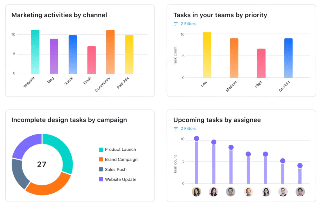
2. Charts and Graphs
Asana offers a range of chart and graph reports that can help you to visualize your project data and track your team’s progress. These reports are a powerful tool for understanding complex data and making data-driven decisions. Here are some of the key features of Asana’s chart and graph reports:
- Customizable Data Fields: Asana’s chart and graph reports allow you to choose the data fields you want to display. This means you can tailor your reports to your specific needs and focus on the metrics that matter most to you. You can select from various project attributes such as task completion dates, assignees, priorities, and custom fields to create highly targeted reports.
- Visual Representations of Data: Charts and graphs visually represent your project data, making it easier to understand complex data sets. These reports can identify data trends, patterns, and anomalies. The visual format helps stakeholders quickly grasp project status and performance metrics without having to analyze raw data tables.
- Real-Time Data: Asana’s chart and graph reports display real-time data, so you can stay up to date with your team’s progress and make timely decisions. The charts automatically refresh as new data is entered or existing information is updated in your projects. This ensures that your reports always reflect the current state of your work and team performance.
- Customizable Filters: Asana’s chart and graph reports allow you to filter your data based on specific criteria. This means you can focus on the data most relevant to your needs. You can apply filters based on date ranges, team members, project status, or any custom fields you’ve created to narrow down your analysis.
- Exportable Data: Asana’s chart and graph reports can be exported to a CSV file, so you can analyze the data further in a spreadsheet program. This export functionality allows you to perform advanced calculations, create additional visualizations, or share data with stakeholders who prefer working with spreadsheet applications. The exported data maintains all the filtering and customization settings you’ve applied to your reports.
- Multiple Report Types: Asana offers a range of chart and graph report types, including bar charts, line charts, and pie charts. This means you can choose the report type that best suits your needs. Each chart type is optimized for different kinds of data analysis, whether you’re tracking progress over time, comparing team performance, or showing proportional relationships between different project elements.
In summary, Asana’s chart and graph reports provide a customizable visual representation of your project data. They allow you to track your team’s progress, identify trends and patterns, and make data-driven decisions. If you’re looking for a way to gain insight into your project data, Asana’s chart and graph reports are an excellent option.
3. Chart Templates and Builder
Asana offers chart templates and a builder feature that allows you to create custom charts based on your project data. These reports are a powerful tool for gaining insight into your team’s performance and making data-driven decisions. Here are some of the key features of Asana’s chart templates and builder reports:
- Pre-Built Chart Templates: Asana offers a range of pre-built chart templates that you can use to create charts based on your project data quickly. These templates include bar charts, line charts, and pie charts. The templates are designed to address common project management reporting needs, allowing you to get started immediately without having to build charts from scratch.
- Customizable Data Fields: Asana’s chart templates and builder reports allow you to choose the data fields that you want to display. This means that you can tailor your reports to your specific needs and focus on the metrics that matter most to you. You can select from project milestones, task dependencies, team workload, and custom fields to create reports that align with your organization’s key performance indicators.
- Drag-and-Drop Interface: Asana’s chart builder feature has a drag-and-drop interface that makes it easy to create custom charts. You can choose from a range of chart types, add data fields, and customize the appearance of your chart. The intuitive interface requires no technical expertise, enabling team members at all skill levels to create professional-looking reports quickly.
- Real-Time Data: Asana’s chart templates and builder reports display real-time data, so you can stay up to date with your team’s progress and make timely decisions. The charts automatically update as tasks are completed, deadlines are modified, or new information is added to your projects. This ensures that your reports always reflect the most current project status and team performance metrics.
- Customizable Filters: Asana’s chart templates and builder reports allow you to filter your data based on specific criteria. This means you can focus on the data most relevant to your needs. You can apply multiple filters simultaneously to drill down into specific time periods, team members, project phases, or priority levels for more targeted analysis.
- Exportable Data: Asana’s chart templates and builder reports can be exported to a CSV file, which means that you can analyze the data further in a spreadsheet program. This export capability enables you to perform advanced statistical analysis, create additional visualizations, or integrate the data with other business intelligence tools. The exported files maintain all formatting and filter settings applied within Asana.
In summary, Asana’s chart templates and builder reports provide a customizable, visual representation of your project data. They allow you to track your team’s progress, identify trends and patterns, and make data-driven decisions. If you’re looking for a way to gain insight into your project data, Asana’s chart templates and builder reports are an excellent option.
Conclusion
Asana reporting is a powerful tool that can help you track your team’s progress, identify areas for improvement, and make data-driven decisions to improve your team’s efficiency. By following the best practices outlined in this article, you can create focused, insightful, and actionable reports. Asana reporting can be customized to fit your specific business needs, whether you’re tracking progress, monitoring workload, or reviewing task completion rates. With Asana reporting, you can stay on top of your projects and ensure your team performs at its best.
FAQs
1. How often should I review my Asana reports?
Reviewing your reports regularly, at least once a week, is a good idea. This will ensure that you are tracking progress towards your goals and making adjustments as needed.
2. Can I export my Asana reports to a spreadsheet program?
Yes, Asana reporting allows you to export your data to a CSV file, which you can analyze further in a spreadsheet program.
3. Can I share my Asana reports with my team members?
Yes, you can share your Asana reports with your team members by exporting them to a CSV file or by giving them access to your Asana account.
4. Can I create custom reports in Asana?
Yes, Asana allows you to create custom reports based on your specific business needs.
5. How can I use Asana reporting to improve my team’s productivity?
By tracking your team’s progress, workload, and task completion rates, you can identify areas where your team is struggling and make data-driven decisions to improve their efficiency.
Suggested articles:
- The Pros and Cons of Using Asana Software
- Asana – Backup & Export your Attachments & Files in Bulk
- Asana – Export Tasks and Subtasks to Excel and CSV
Daniel Raymond, a project manager with over 20 years of experience, is the former CEO of a successful software company called Websystems. With a strong background in managing complex projects, he applied his expertise to develop AceProject.com and Bridge24.com, innovative project management tools designed to streamline processes and improve productivity. Throughout his career, Daniel has consistently demonstrated a commitment to excellence and a passion for empowering teams to achieve their goals.